


INSPIRE OAKLAND
Celebrating Oakland’s skating community through inclusive design.
Project Type
Design Challenge
Client
BRIDGEGOOD
Responsibilities
Visual Designer
+ Research
+ Concept Development
+ Final Design
+ Multi-Platform Adaptation
Project Duration
January - May 2025
Outcome
Top 20 finalist out of 500+ submissions
Tools
Adobe Illustrator
Challenge
Create an iconic visual design for Inspire Oakland that authentically represents the city's diverse communities and captures what makes Oakland inspiring.
Goal
Develop an original design that resonates with Bay Area residents through unique creativity, diverse representation, and innovative spirit.
Affected Population
Oakland residents, Bay Area communities, and travelers

01
Research
02
Ideation
03
Design Development
Challenges
& Solutions
04
05
Final Solutions
Research
01
I conducted field research in Oakland's Lake Merritt and Brooklyn Basin communities, engaging with local skaters, dancers, musicians, and artists.
Through observation and conversations, I explored how inclusive culture emerges around skating, how art and movement intersect in shared spaces, and Oakland's distinctive grassroots visual language.
I also studied BRIDGEGOOD's mission and past Inspire Oakland designs to understand how design can effectively drive social impact.
Ideation
02
Drawing from my research synthesis, I brainstormed potential solutions and sketched initial concepts to capture Oakland's inspiring essence.
I conceptualized three distinct approaches that emerged from my community observations.
Three Initial Concepts:
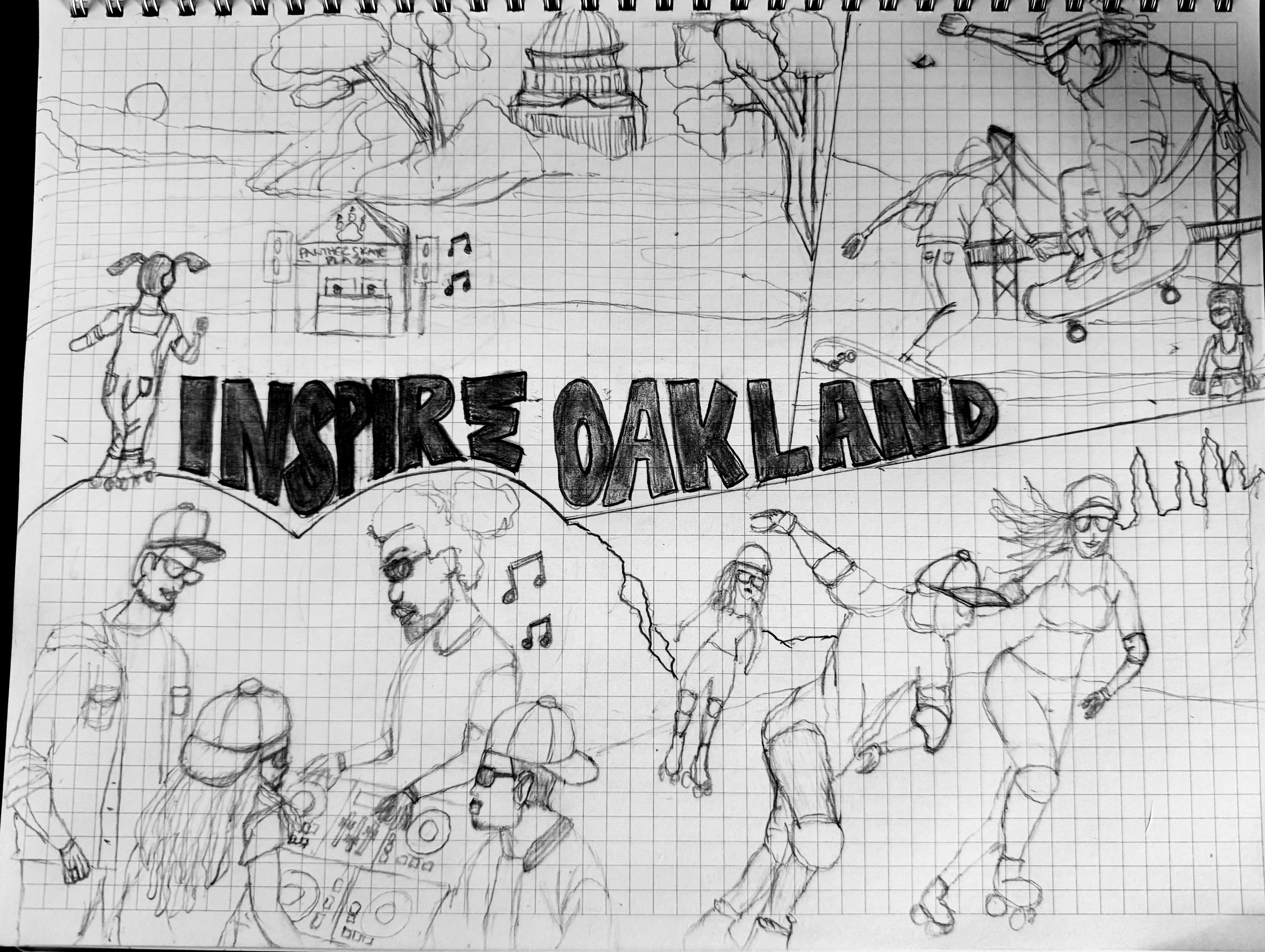
Skating Community Concept - Dynamic figures in motion with musical elements and bold "INSPIRE OAKLAND" typography, capturing the energy and rhythm of Oakland's skating scene.

Rooted in Oakland Concept - Diverse portraits integrated with Oakland's iconic architecture and landmarks, celebrating the city's cultural diversity and community pride.

LGBTQ+ Community Concept - Bridge setting with intersectional messaging including "Black Lives Matter" and "Love is Love," representing Oakland's history of social justice and inclusivity.
Stakeholder Feedback:
Shaun: "I could see the skating community concept as a billboard - it's original and I've never seen this done before.
I could see this potentially making it to the Top 20. The sketch follows specs and aligns with BRIDGEGOOD's mission."
Alex: "The skating community concept is very original and dynamic - it displayed action and movement. I wanted to see more of it."
Why Other Concepts Didn't Work:
• Rooted in Oakland: "Has been done before and wouldn't be an original design, didn't get the concept in 3 seconds"
• LGBTQ+ Pride: "Concept has been done before, messaging wasn't focused"
Key Insight:
Through community research and open lab feedback, the skating community emerged as the strongest direction - representing Oakland's inclusive, joyful, and resistant spirit.
Finding Focus Through Experience
The Pivotal Moment:
During my first Oakland rollout, our skating group traveled from Lake Merritt to Brooklyn Basin, where drag queens hosted an end-of-month skating performance. Witnessing numerous supporters embrace this beautiful intersection of communities showed me Oakland's true magic - radical inclusivity in action.
Design Goals:
•Capture the vibrant energy of Brooklyn Basin skating culture
•Convey movement, unity, and joyful resistance
•Represent diverse identities within the community
•Create designs that work across multiple mediums
Design Development
“Three figures, one community”
03
1. Visual Research Foundation
Created a comprehensive moodboard capturing the authentic Brooklyn Basin atmosphere - from drag roller skate performances to community gatherings at the waterfront.
This research established the energy and inclusivity that needed to translate into every design application.
Moodboard


2. Design System Development
Developed a cohesive style guide spanning multiple touchpoints - bulletin boards, bus benches, in-app advertisements, and LED airport displays.
Color palettes were extracted directly from Brooklyn Basin's horizon and waterfront, ensuring each medium maintained environmental authenticity while meeting specific visibility requirements.
Style Guide

3. From Sketch to Digital

Initial Digital Translation - The first digital iteration brought the three-figure concept to life, establishing the core composition and Brooklyn Basin setting that would define the final designs.
4. Initial Feedback Integration:
During open lab sessions, peers and stakeholders identified key areas for improvement:

Initial Peer Feedback Summary
Initial Design
After Refinement
Composition Balance:
"Bottom right looks empty" - needed better balance
Response:
Added complementary visual elements
Improved figure positioning for dynamic flow
Created stronger visual triangle
Visual Depth & Layering:
“Add depth through strategic overlapping elements”
Response:
Implemented layering hierarchy
Added dimensional elements
Created depth through positioning
Typography & Hierarchy:
"Adjust Typography placement for optimal readability”
Response:
Enhanced "INSPIRE OAKLAND" prominence
Improved contrast and sizing
Strategic layering with figures
Color & Distance Visibility:
“Ensure that you have full visibility when viewing from a distance”
Response:
Implemented layering hierarchy
Enhanced color contrast
Optimized for distance legibility
Improved cohesion across palette
Stakeholder Refinement Focus

Character 1 - Face Detail
Issue: Facial features
too subtle for billboard distance viewing

Character 1 - Face Refined
Solution: Enhanced nose definition, clearer features for distance viewing

Character 2 - Face Detail
Issue: Facial features too subtle
for billboard distance viewing

Character 2 - Face Refined
Result: Applied facial refinements consistently across all community figures

Character 3 - Face Detail
Issue: Facial features
too subtle for billboard distance viewing

Character 3 - Face Refined
Result: Applied facial refinements consistently across all community figures
Strategic Medium Adaptation

Social Media Application
Strategy: Enhanced vibrancy and saturation to capture attention in social media feed

Bus Bench Application
Strategy: Added hashtag for social sharing, encourages pedestrian engagement

Bulletin Billboard Application
Strategy: Maximum legibility for high-speed viewing, no distracting elements
Final Design Applications

Social Media Application - Bold, scroll-stopping design with bold pink typography optimized for high contrast mobile viewing and social engagement.

Bulletin Billboard Application - Vibrant gradient background with bold blue typography, optimized for long-distance viewing and driving speeds with maximum visual impact.

Bus Bench Application - Elongated format with added hashtag (#INSPIREOAKLAND) for social engagement, repositioned figures for horizontal viewing, and enhanced typography visibility for transit audiences.
Strategic Design Decisions
Technical Refinements:
Facial Clarity: Enhanced nose definition and features for distance viewing
Color Strategy: Varied shirt colors and typography across mediums for judge differentiation
Medium-Specific Adaptations: Each version intentionally adapted to its specific context and audience behavior
Strategic Insight: Rather than replicating one design across formats, each version was intentionally adapted to its specific context and audience behavior, maximizing impact and accessibility.
This approach ensures optimal viewing experiences whether someone encounters the design while scrolling on their phone, waiting at a bus stop, or driving past a billboard at highway speeds.
Challenges
& Solutions
04
Throughout the design process, I encountered several key challenges that required strategic problem-solving and iterative refinement.
Technical Constraints vs. Creative Vision
Challenge: Balancing artistic vision with technical requirements across multiple mediums
Solution: Researched billboard design best practices and tested viewing distances to ensure readability while maintaining the design's energetic, community-focused aesthetic
Managing Stakeholder Feedback
Challenge: Synthesizing diverse feedback from multiple reviewers with varying perspectives
Solution: Prioritized changes that served the primary goal - authentic community representation - while maintaining design integrity and visual impact
Design Evaluation Independence
Challenge: Creating designs that judges could evaluate without backstory or context
Solution: Made strategic color variations that let each version stand independently while maintaining visual consistency, ensuring each application communicated effectively on its own merits
Key Outcomes
These challenges ultimately strengthened the final design by forcing me to balance creative expression with practical constraints, stakeholder needs, and evaluation criteria.
Final Solutions
05


Impact & Recognition
Achievements
Top 20 Finalist out of 500+ submissions
Multiple format adaptations demonstrating design versatility
Community-centered design process showcasing authentic research methodology
Real-World Applications
Social media campaigns reaching Oakland's skating community
Public transportation visibility through bus bench placements
High-traffic billboard exposure across
Bay Area FreewaysHigh-traffic LED screen exposure across
Bay Area airports
Community Response
The design resonated with Oakland's skating community, achieving the goal of authentic representation while attracting broader civic engagement with Inspire Oakland's mission.
Reflection
"Design as community celebration"
This project reinforced my belief that authentic design stems from genuine community connection.
By immersing myself in Oakland's skating culture rather than making assumptions, I created work that genuinely represents the people it celebrates.
Key Learnings
Community research creates more authentic outcomes than demographic assumptions
Strategic format adaptation amplifies design impact across contexts
Iterative feedback integration strengthens both design and professional collaboration skills
Personal connection to subject matter enhances creative authenticity
Personal Growth
This challenge demonstrated my ability to balance client objectives with community representation, manage complex feedback cycles, and create adaptable design systems - essential skills for impactful visual design.
Design Process Evolution
The visual journey from initial sketches to final digital applications showcases a methodical approach to concept development, community-centered research, and strategic adaptation across multiple mediums.