

Paws & Pages
Building a brand strategy and visual identity around an unoccupied triple-niche: romance reads, dogs, and red wine
PROJECT TYPE
Brand Strategy & Visual Identity
CLIENT
Paws And Pages (@pawsandpagesca)
RESPONSIBILITIES
Brand Strategist & Designer
Brand Discovery & Research
Competitive Analysis
Visual Identity System
Logo & Typography Design
Social Media Toolkit
PROJECT DURATION
April - June 2026
OUTCOME
Delivered a comprehensive, cross-platform brand system and social strategy that establishes a distinct market presence in an unoccupied triple-niche
TOOLS
Adobe Photoshop
Adobe Illustrator
Adobe InDesign
Figma
About
Paws & Pages is an online creator brand and book community that blends unfiltered romance & fantasy reviews, cozy pet moments, and curated red wine pairings.
Problem
In a saturated BookTok and BookStagram landscape, creator-led accounts struggle to stand out without a clear visual identity. Without dedicated branding or scalable visual systems, Paws & Pages lacked the visual polish needed to claim its unique market position and convert casual viewers into community members.
Solution
Built a complete visual identity and social design toolkit focused on an unoccupied triple-niche: Spicy Reads, Dogs, and Wine. The system features custom logo variants, a dark-and-light color palette, and flexible templates that keep content production fast while maintaining consistent brand recognition across platforms.
Concept
"Warm, Unfiltered Bestie." Combining cozy, editorial typography with rich tones (dark forest green, soft cream, berry red) to balance the sophistication of a wine night with the approachable warmth of reading on the couch with your dog.

01
Discovery & Research
02
Competitor Analysis
03
Visual Identity
Social System
04
05
Brand Guidelines
Discovery & Research
01
I conducted a comprehensive brand audit of top literary creators across BookTok and Bookstagram to isolate why independent accounts struggle to scale. While Paws & Pages maintained a highly dedicated community and an exceptional 8.41% organic content engagement rate, the account lacked a professional, unified identity system.
My research revealed that identical naming conventions and repetitive visual trends across the book community cause massive audience confusion. To stand out and protect the brand's long-term commercial authority, developing a distinctive, mascot-centric visual anchor was an immediate business priority.
Competitor Analysis
02
Through market synthesis, I identified an entirely unoccupied "triple-niche" at the intersection of Spicy Romance Reads, Cozy Dogs, and Curated Wine Pairings. While competing brands focus heavily on single-topic aesthetics, none seamlessly integrated this highly relatable lifestyle trifecta.
To capture this market void, we established a strategic creative direction titled "Warm, Unfiltered Bestie." This framework balances high-end literary sophistication with the approachable, cozy warmth of reading on the couch with a pet.
Figure 1.1: Competitor matrix identifying the unoccupied market positioning.
Figure 1.2: Initial "Cozy Literary" creative direction mood board utilized during early client alignment sessions.
03
Visual Identity System
The Collaborative Pivot
While our initial creative direction focused on a traditional, typography-heavy editorial style, subsequent client alignment sessions revealed a deeper business need. We realized that to truly capture the "Warm, Unfiltered Bestie" ethos and protect the brand's long-term merchandise monetization strategy, we needed a powerful, approachable visual anchor.
Rather than relying solely on abstract layout style, we collectively decided to pivot toward a mascot-centric identity system. This allowed us to maintain high-end literary credibility while creating an instantly recognizable, humanized brand mark that the community could rally behind.
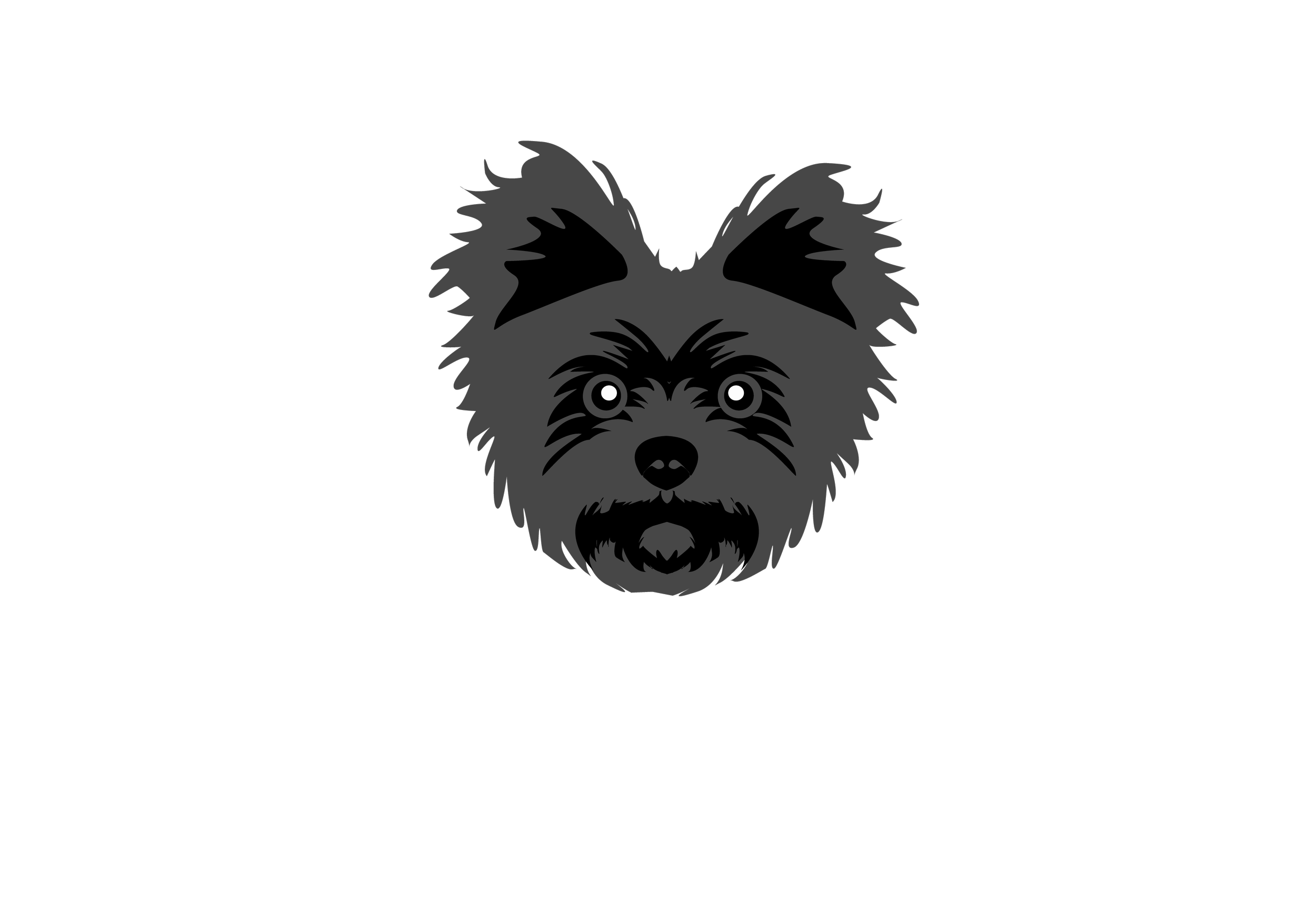
Final Logo
Challenges
& Solutions
04
Throughout the design process, I encountered several key challenges that required strategic problem-solving and iterative refinement.
Technical Constraints vs. Creative Vision
Challenge: Balancing artistic vision with technical requirements across multiple mediums
Solution: Researched billboard design best practices and tested viewing distances to ensure readability while maintaining the design's energetic, community-focused aesthetic
Managing Stakeholder Feedback
Challenge: Synthesizing diverse feedback from multiple reviewers with varying perspectives
Solution: Prioritized changes that served the primary goal - authentic community representation - while maintaining design integrity and visual impact
Design Evaluation Independence
Challenge: Creating designs that judges could evaluate without backstory or context
Solution: Made strategic color variations that let each version stand independently while maintaining visual consistency, ensuring each application communicated effectively on its own merits
Key Outcomes
These challenges ultimately strengthened the final design by forcing me to balance creative expression with practical constraints, stakeholder needs, and evaluation criteria.
Final Solutions
05


Impact & Recognition
Achievements
Top 20 Finalist out of 500+ submissions
Multiple format adaptations demonstrating design versatility
Community-centered design process showcasing authentic research methodology
Real-World Applications
Social media campaigns reaching Oakland's skating community
Public transportation visibility through bus bench placements
High-traffic billboard exposure across
Bay Area FreewaysHigh-traffic LED screen exposure across
Bay Area airports
Community Response
The design resonated with Oakland's skating community, achieving the goal of authentic representation while attracting broader civic engagement with Inspire Oakland's mission.
Reflection
"Design as community celebration"
This project reinforced my belief that authentic design stems from genuine community connection.
By immersing myself in Oakland's skating culture rather than making assumptions, I created work that genuinely represents the people it celebrates.
Key Learnings
Community research creates more authentic outcomes than demographic assumptions
Strategic format adaptation amplifies design impact across contexts
Iterative feedback integration strengthens both design and professional collaboration skills
Personal connection to subject matter enhances creative authenticity
Personal Growth
This challenge demonstrated my ability to balance client objectives with community representation, manage complex feedback cycles, and create adaptable design systems - essential skills for impactful visual design.
Design Process Evolution
The visual journey from initial sketches to final digital applications showcases a methodical approach to concept development, community-centered research, and strategic adaptation across multiple mediums.