

UX/UI CASE STUDY
NAVI is a mobile app that transforms how users find and book salon services, offering proximity-based salon discovery and virtual consultations to meet the needs of busy professionals.
NAVI
Project Type
Undergraduate Capstone Project
Responsibilities
UX Research
+ UI/UX Design
+ User Testing
Project Duration
January - May 2024
Tools
Figma
Research Overview
41 Survey Participants with quantitative insights
9 Usability Tests (2 rounds: 4-5 users each, 30-minute sessions)
5 Major Competitors Analyzed (StyleSeat, Mindbody, Square, Go.Booker, Booksy)
20 Screens Prototyped in Figma with iterative improvements
3 Key Issues Identified & Solved
Expert validation from Business Communication and Product Design professionals
Challenge
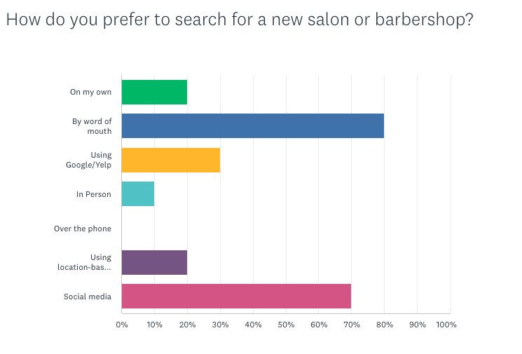
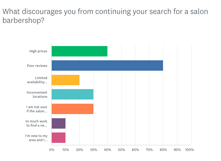
Finding local salons in unfamiliar areas is challenging, with 80% of users abandoning searches due to negative reviews and location uncertainty. Customers often remain unsure if the chosen salon meets their needs until their appointment.
Key Research Insights:
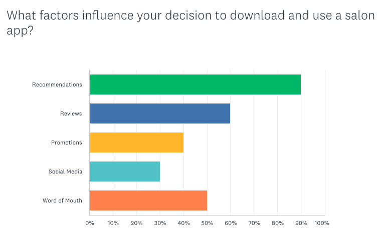
80% rely on word-of-mouth recommendations
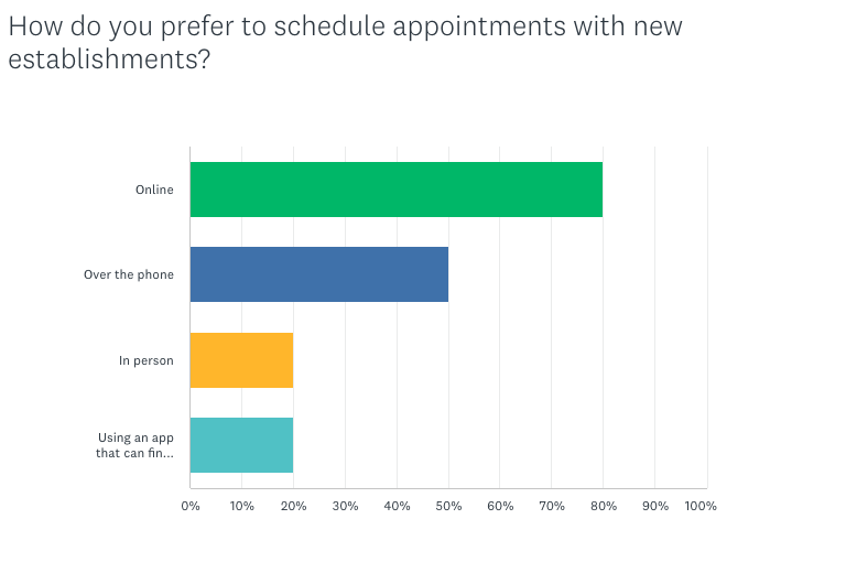
80% prefer online booking capabilities
60% of salon appointments are made outside business hours
Users abandon searches when they can't verify salon quality
Goal
Design a solution that eliminates the guesswork from salon discovery, allowing users to find and connect with the right professionals quickly and confidently
Affected Population
Working professionals and frequent travelers who need reliable salon services in unfamiliar locations

01
Research
02
Ideation
03
Design Development
04
Testing
05
Final Solutions
Research
01
The Discovery Challenge
To better understand how Navi could improve customer experience and engagement, I conducted comprehensive research into salon discovery and booking behaviors.
My preliminary findings revealed that customer loyalty is driven by hassle-free experiences, particularly around online booking, salon discovery, and virtual consultations.
Key Research Insights:
Mobile booking applications enhance salon operations through streamlined appointment management, 24/7 availability, and automated processes
60% of salon appointments are made outside of regular business hours
Technologies like video conferencing and digital assistants have revolutionized customer experiences by meeting immediate consumer needs
Consumers expect immediate results and personalized experiences - without these, they abandon their search
Geolocation services are vital for mobile users, helping them find nearby businesses, navigate efficiently, and receive personalized recommendations
The ability to locate businesses and get directions from a user's current location significantly reduces stress and improves customer acquisition
This research helped me understand that successful salon apps must prioritize speed, personalization, and location-based convenience to meet modern user expectations.
Quantitative Research Findings
Through comprehensive user research with 41 participants, I uncovered critical insights that shaped Navi's core functionality:
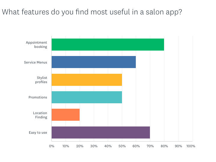
Booking Preferences:
80% prefer online booking vs 50% phone bookings
60% of salon appointments are made outside business hours
Decision-Making Factors:
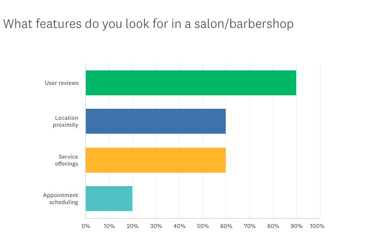
90% prioritize high user reviews when selecting salons
80% stop searching due to negative reviews
80% rely on word-of-mouth recommendations
60% prioritize proximity to location
These findings directly informed my design approach, with 90% prioritizing reviews leading me to make ratings a key visual element.
Primary Research
To understand the competitive landscape and user needs, I conducted both competitive analysis and user research to identify opportunities for Navi to stand out in the market.
Research Methods:
Competitive analysis of 5 major competitors (StyleSeat, Mindbody, Square, Go.Booker, Booksy) revealed critical market opportunities:
Outdated UI design across 4 out of 5 platforms
Poor mobile optimization limiting user engagement
Information overload causing decision paralysis
Booksy was the only competitor without significant shortcomings
This analysis revealed a clear opportunity to create a streamlined, mobile-first solution.
User surveys with 41 participants to uncover how people currently discover and choose new salons
Data synthesis through affinity mapping, empathy mapping, and persona development
This multi-method approach provided deep insights into user behaviors and pain points, enabling me to design solutions that address real user needs rather than assumptions.
Expert Validation
To validate my research direction, I consulted with industry professionals:
Business Communication Expert: Confirmed the critical importance of speed and consistency in digital booking experiences
Product Designer: Emphasized sustainable UX principles and the role of emotional design in building user trust
This expert feedback validated our focus on streamlined user flows and trust-building visual elements.
Surveys
The main objective was to understand key factors that influence users when choosing new salons, including location preferences, accessibility needs, and desired features.
Survey Details:
Platform: SurveyMonkey distributed across social media channels
Participants: 41 anonymous respondents of all genders, ages 21+
Focus areas: Location priorities, salon accessibility, and feature preferences
This sample size provided sufficient data to identify clear patterns in user behavior and decision-making processes when selecting salon services.


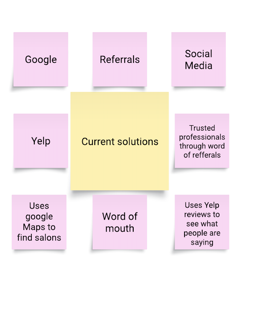
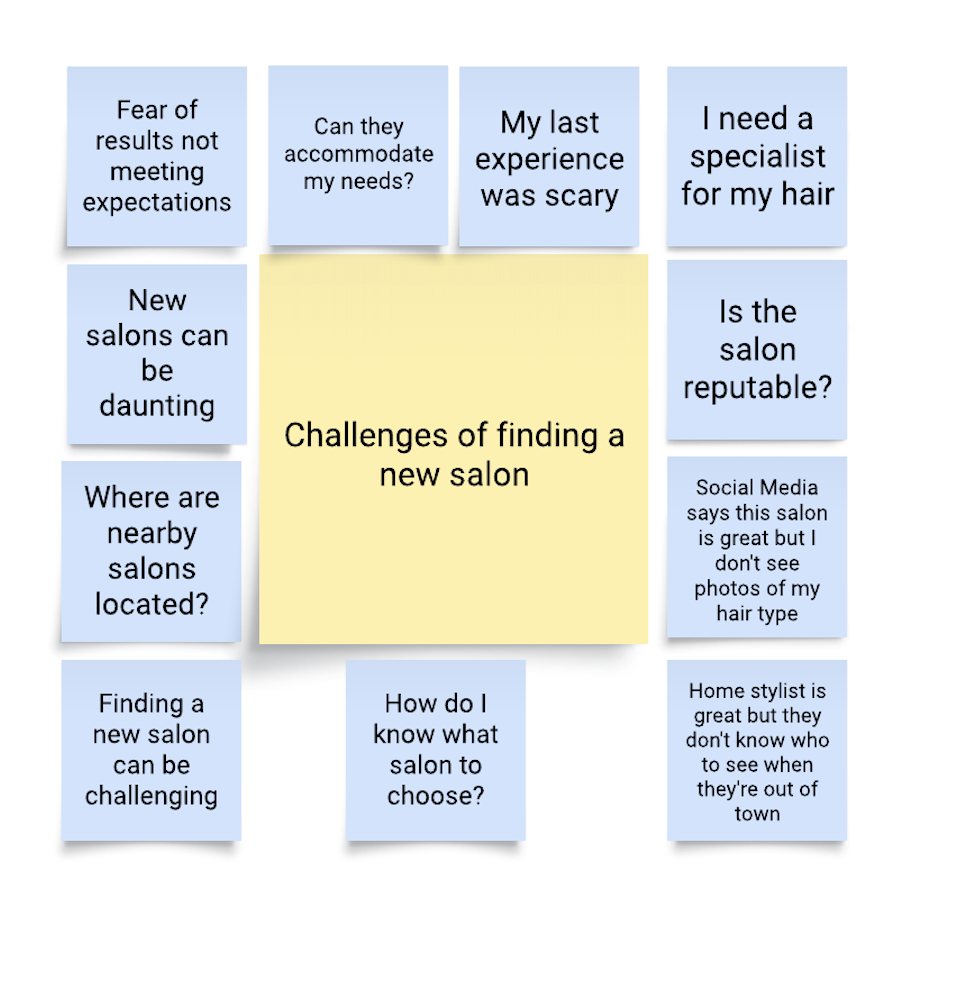
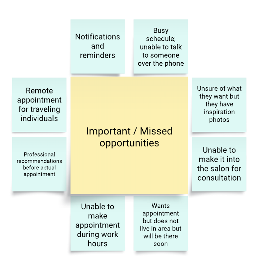
Affinity Map
With the data gathered from the surveys, I developed an affinity map to identify patterns and insights across 41 user responses. Three key themes emerged from clustering user feedback:
Key Themes:
Current Solutions - Users primarily rely on Google Maps, Yelp reviews, word-of-mouth referrals, and social media to discover salons, with trusted professionals through referrals being the most valued approach
Pain Points - Major challenges include fear of unmet expectations, uncertainty about accommodation of specific needs, difficulty finding nearby locations, concerns about salon reputation, and challenges with scheduling during work hours
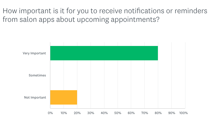
Opportunity Areas - Unmet needs such as remote appointment booking for travelers, professional recommendations before appointments, notifications and reminders, appointment flexibility for busy schedules, and better ways to communicate specific style inspirations to stylists
This synthesis revealed a clear gap between how users currently find salons and what they actually need - more transparency, personalized recommendations, and flexible booking options that accommodate busy lifestyles and specific hair requirements.
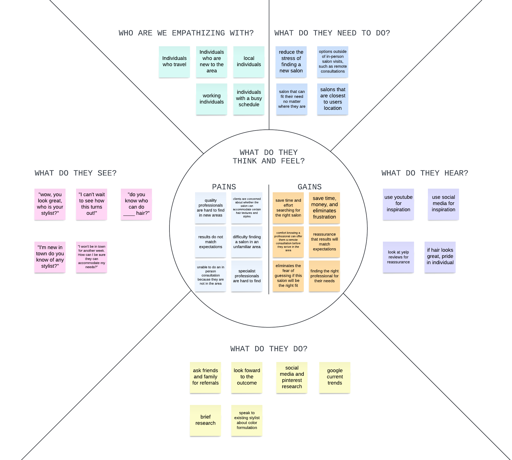
Empathy Map
Through comprehensive empathy mapping research, I successfully identified and developed a primary user persona: "The Busy Executive" - a time-constrained professional who represents the core target audience for salon booking solutions.
Key Empathy Map Insights:
Primary User Groups: Travelers, locals new to areas, working professionals, and individuals with busy schedules all share similar salon discovery challenges
Core Pain Points: Users struggle with finding quality professionals, uncertainty about results matching expectations, and difficulty locating salons in unfamiliar areas
Information-Seeking Behavior: Users rely on social media research, friend referrals, and Google trends to make decisions, indicating a need for consolidated information sources
Emotional Drivers: Time-saving and reduced stress are primary motivators, with users seeking reassurance that results will match their expectations
Communication Preferences: Users want direct stylist consultation and clear information about services before committing to appointments

Persona
The Busy Executive
Natasha Manning
35 years old, Marketing Executive, San Francisco, CA.
Core Characteristics
High time constraints due to demanding professional schedules
Frequent travel requiring salon services in multiple locations
Quality-focused but limited research time
Convenience-driven decision making process
BIO
Natasha is a marketing executive at a San Francisco tech company who manages multiple campaigns and frequently travels for business. She maintains a polished appearance while juggling demanding deadlines and an unpredictable schedule.
Pain Points
Difficulty finding trusted salon services when traveling or relocating
Limited time for thorough research and consultation processes
Anxiety about service quality with unfamiliar providers
Scheduling conflicts with traditional salon operating hours
Primary Needs:
Location-based salon discovery with proximity filtering
Quick access to reliable reviews and social proof
Flexible scheduling options that accommodate changing business needs
Streamlined booking process without extensive consultation requirements
Ideation
02
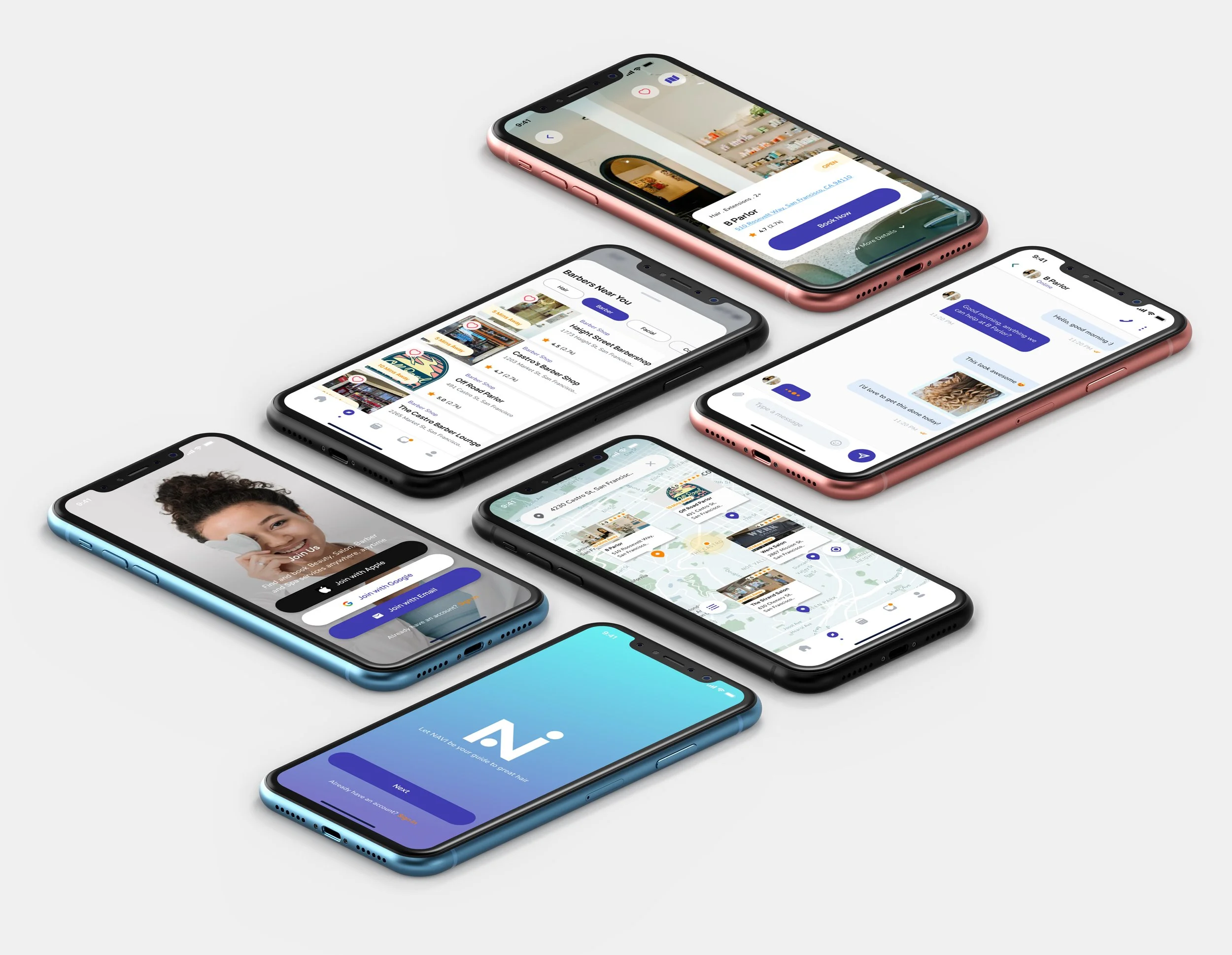
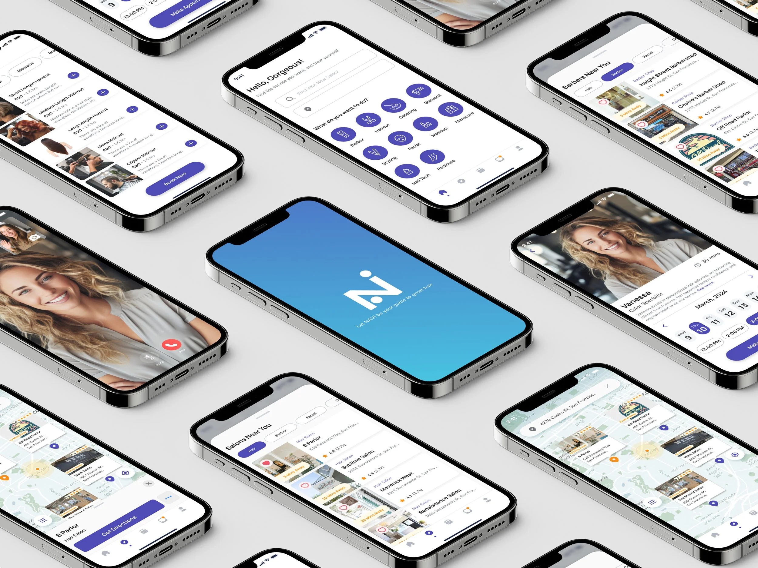
Six Screen Concepts:
Based on my research insights I identified critical pain points and designed 6 strategic screen concepts that transform how users discover salons, navigate locations, and book services—from an intuitive home dashboard to seamless virtual consultations.
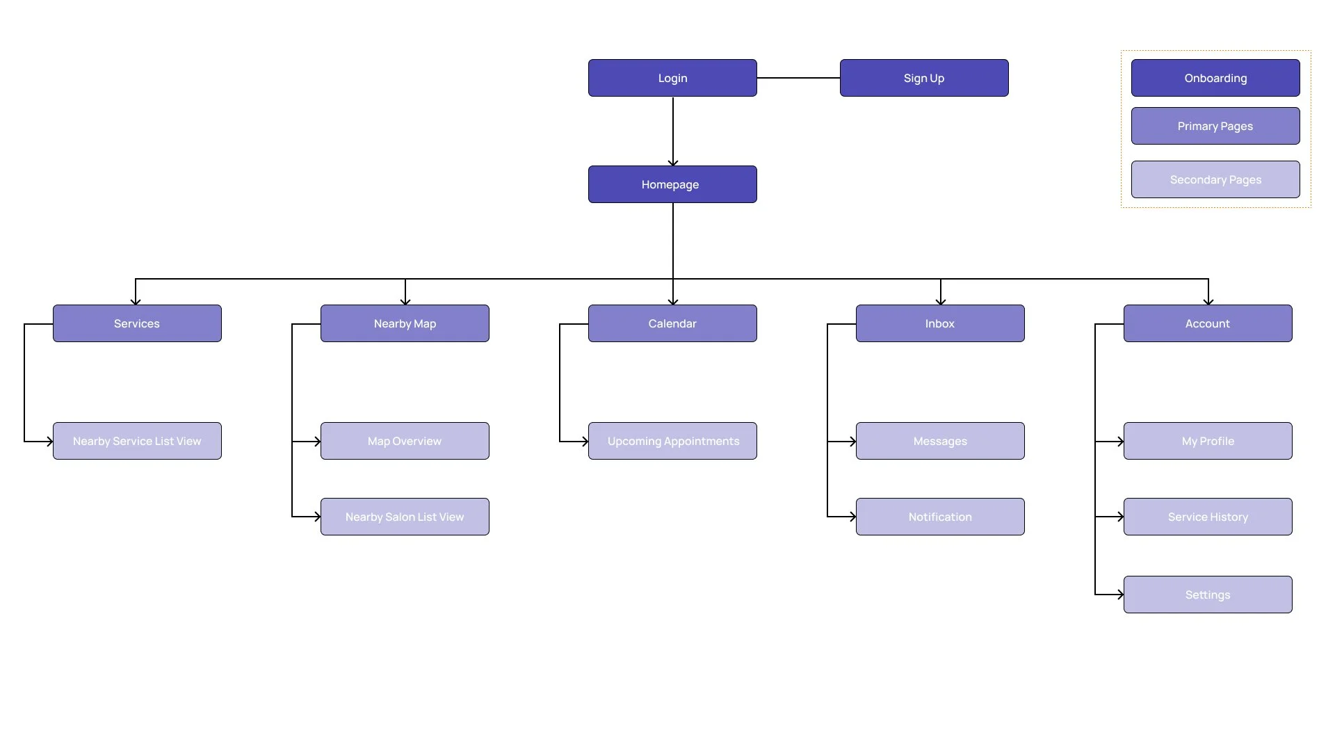
Site Map
I developed a sitemap to create a clear, organized app structure that transforms the overwhelming salon discovery process into manageable, logical steps.
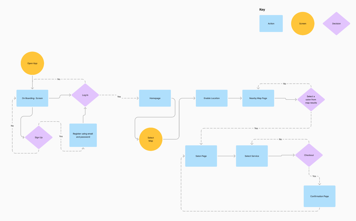
User Flow
Exploratory Sketches
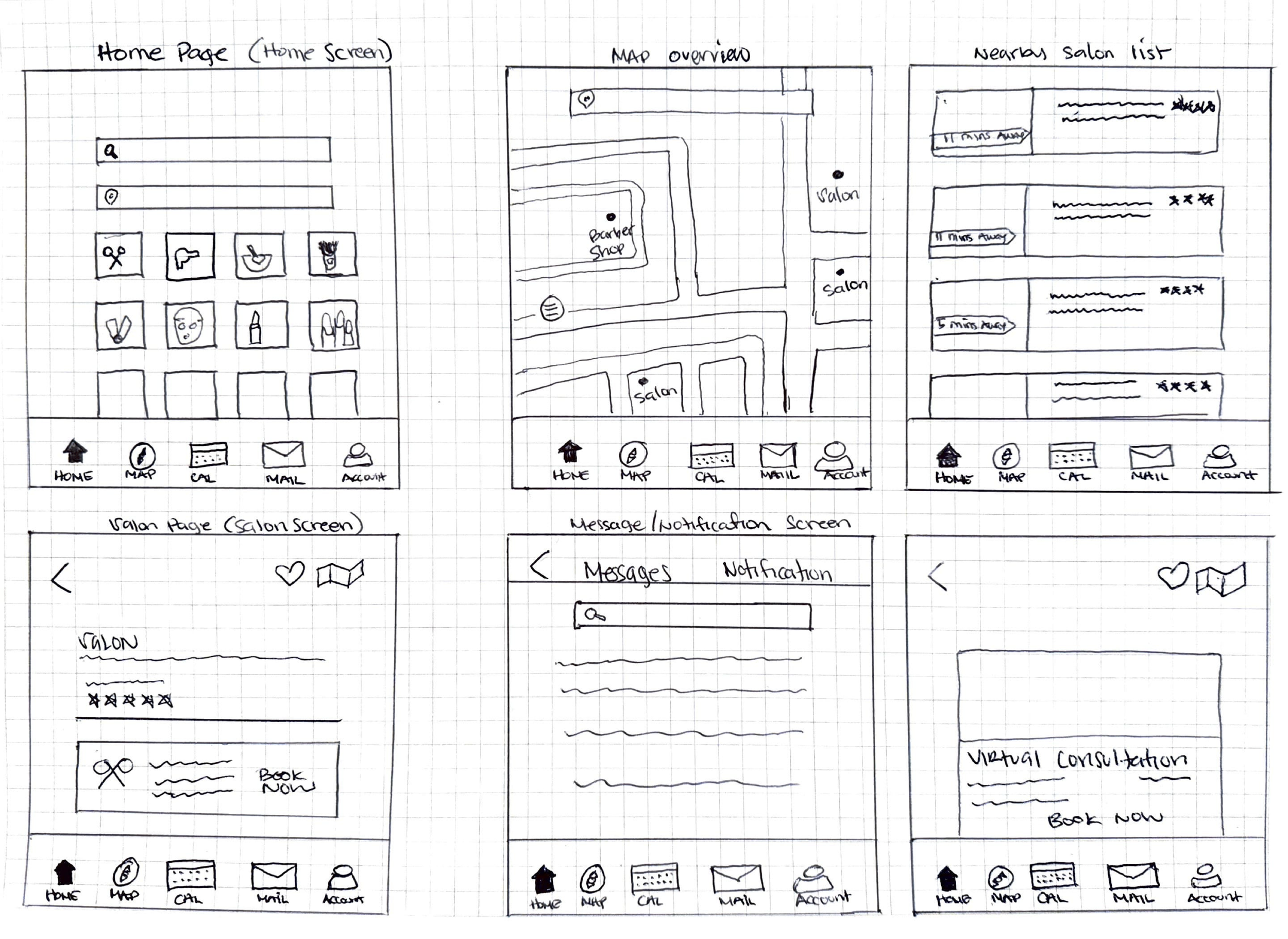
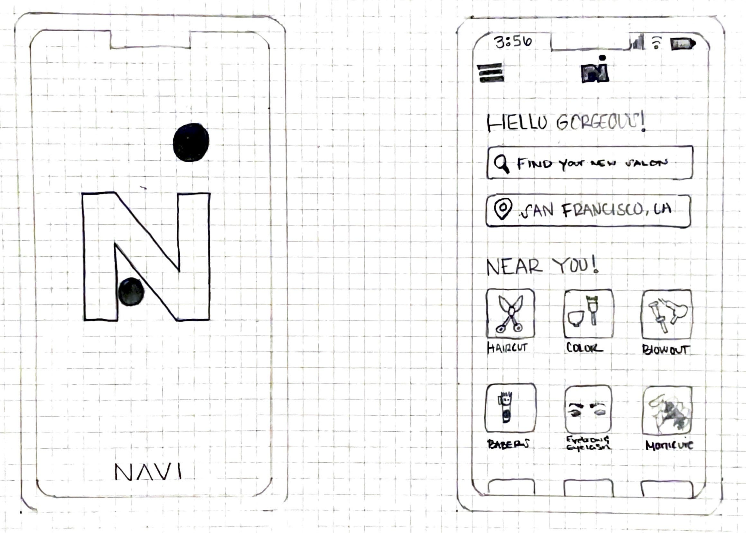
I translated my research insights into initial design concepts through sketching, using the user flows and sitemap as guides to draft screens that would streamline the salon booking experience. After sketching key interfaces, I conducted feedback sessions with six users to validate my design direction and identify areas for refinement.
Exploratory Sketch 1
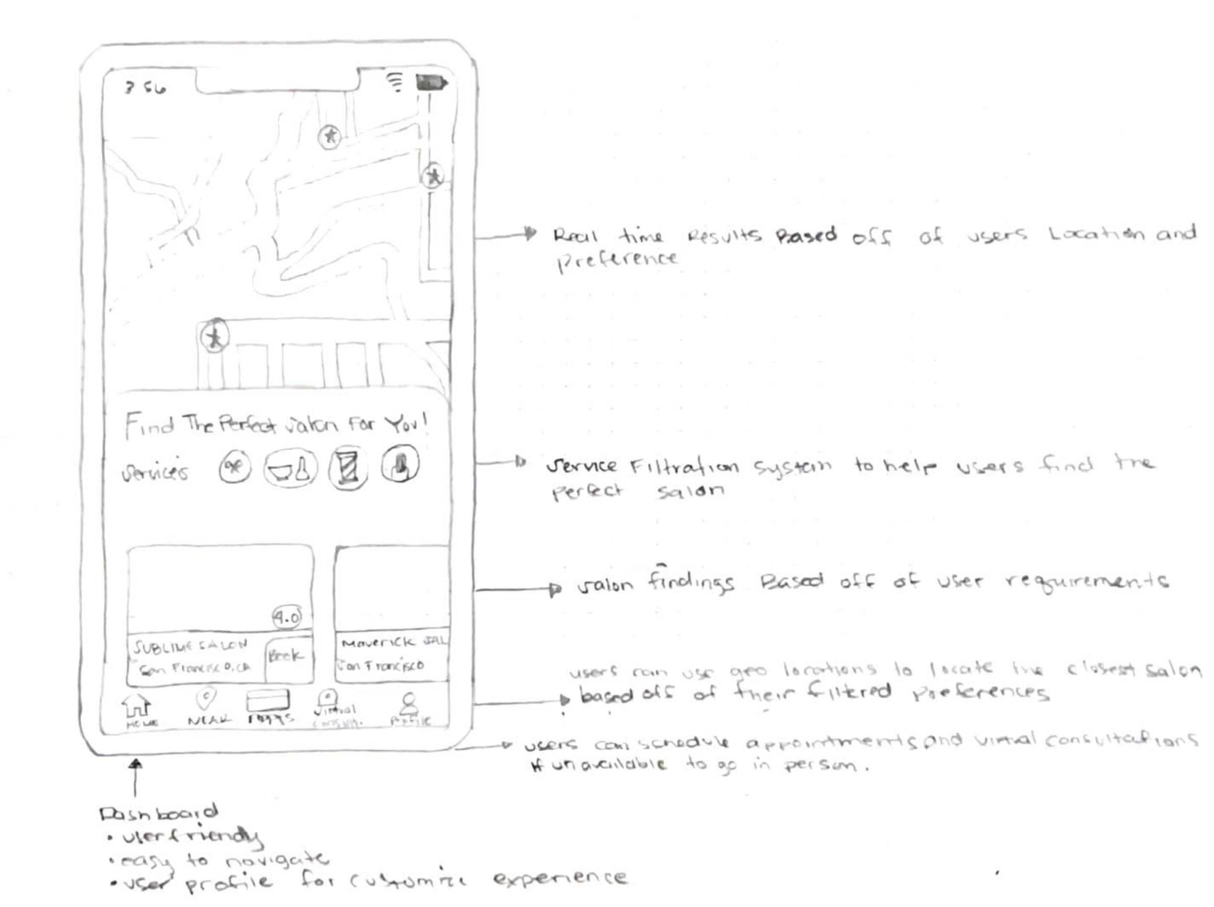
Exploratory Sketch 2
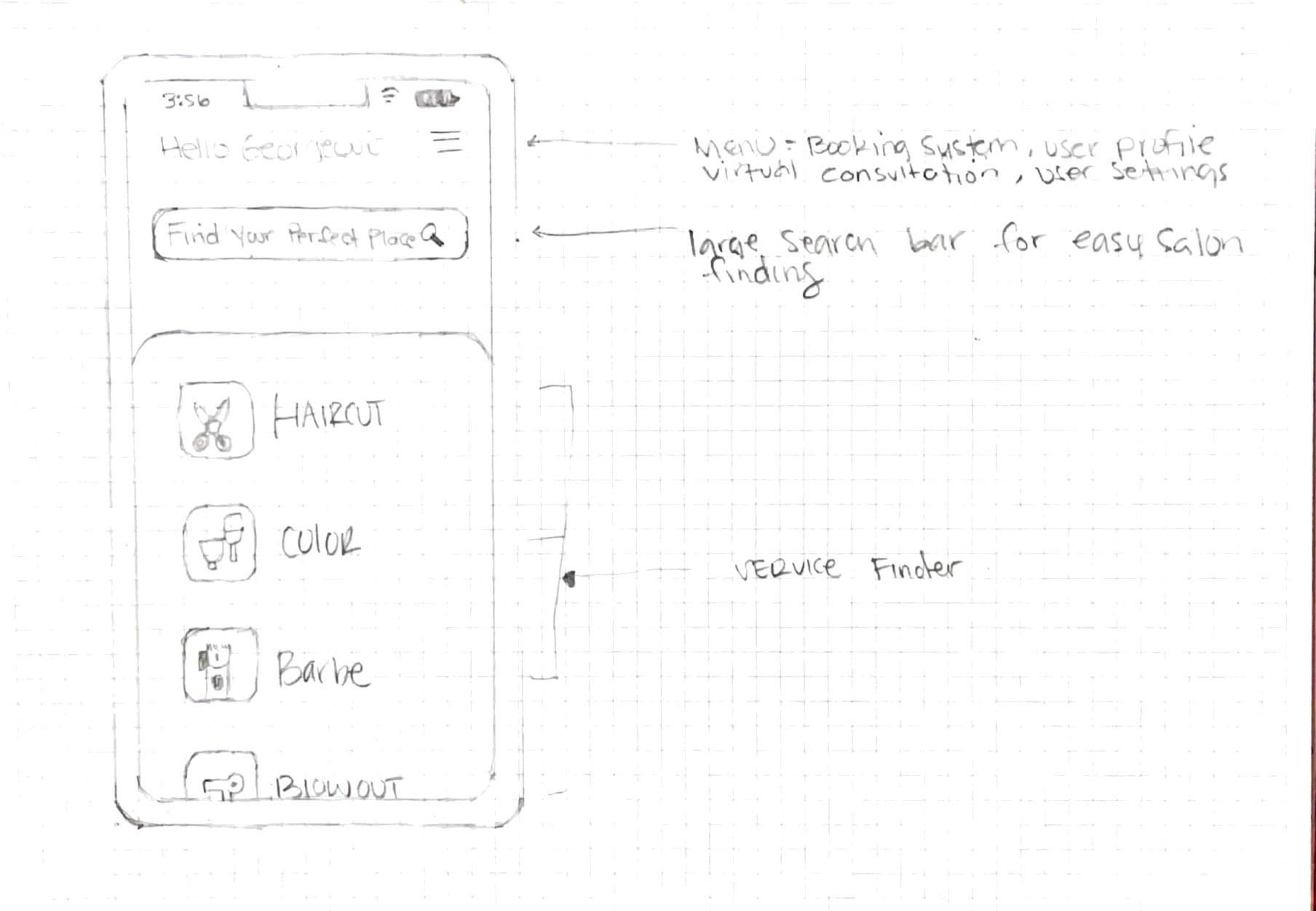
Exploratory Sketch 3
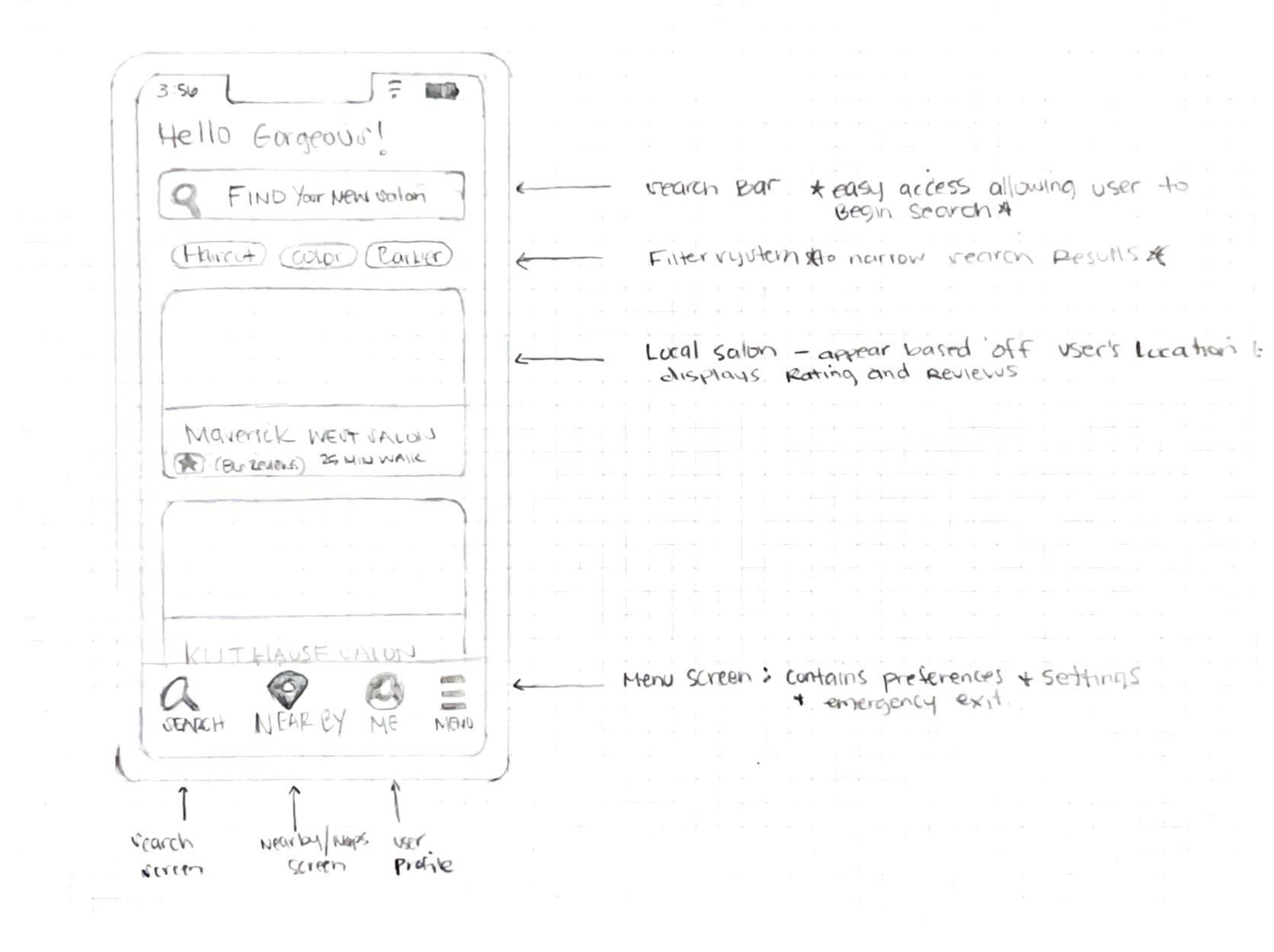
Exploratory Sketch 4
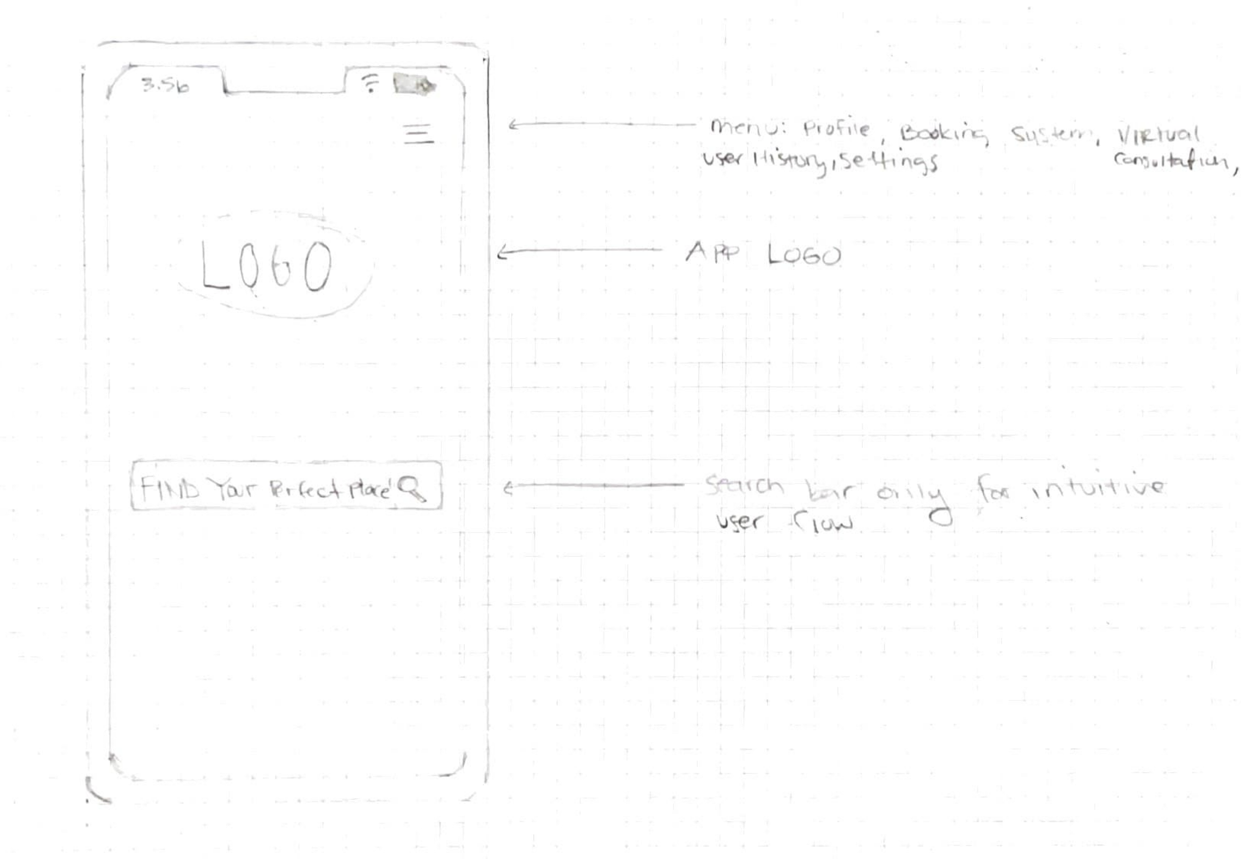
Exploratory Sketch 5
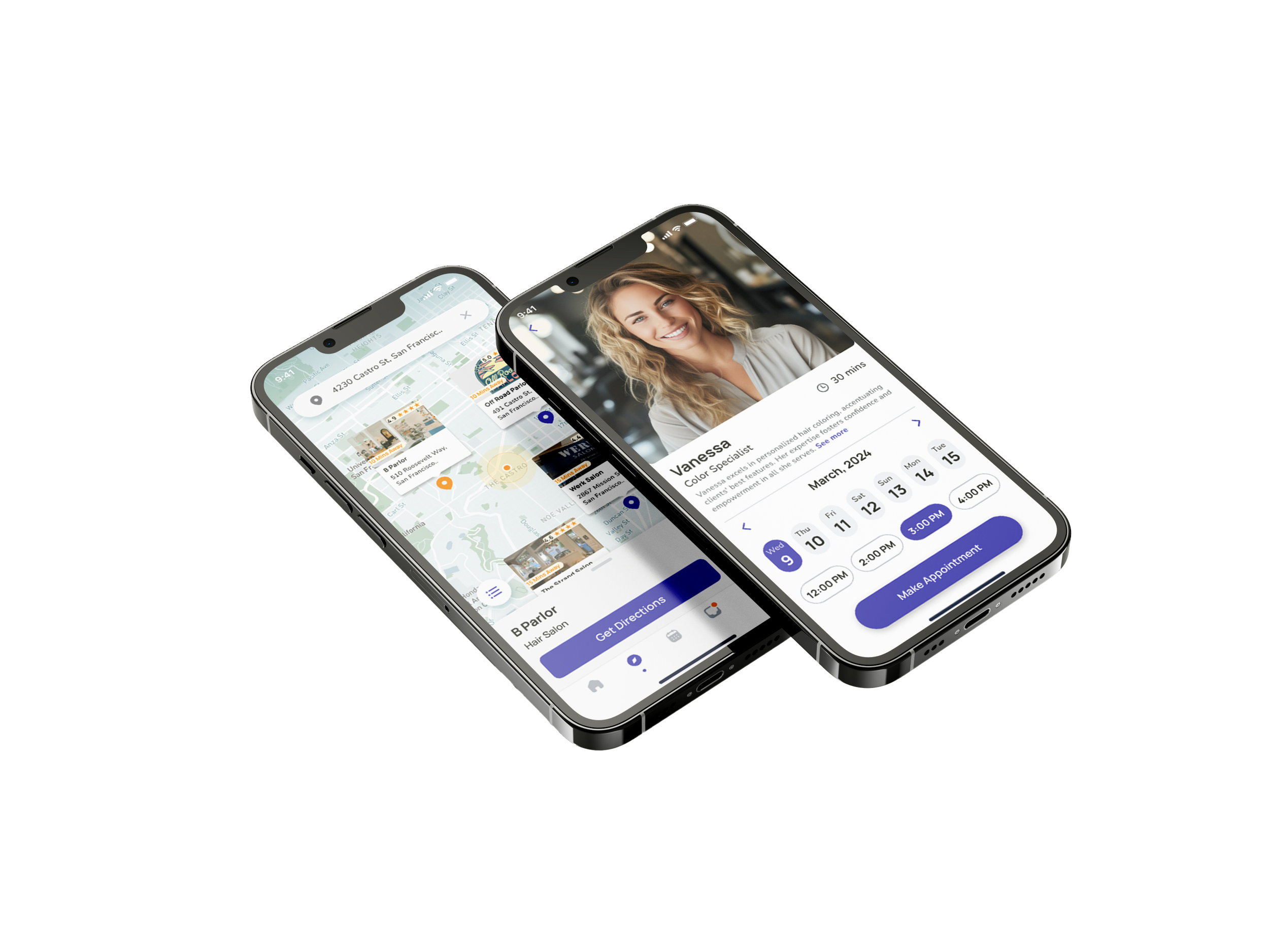
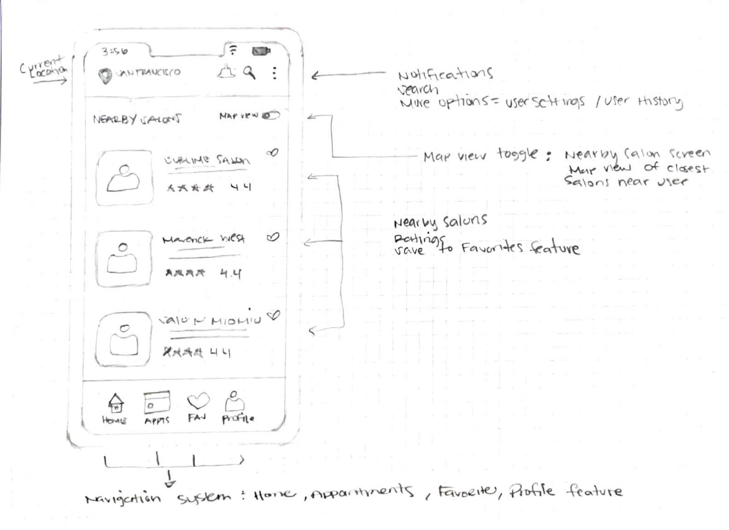
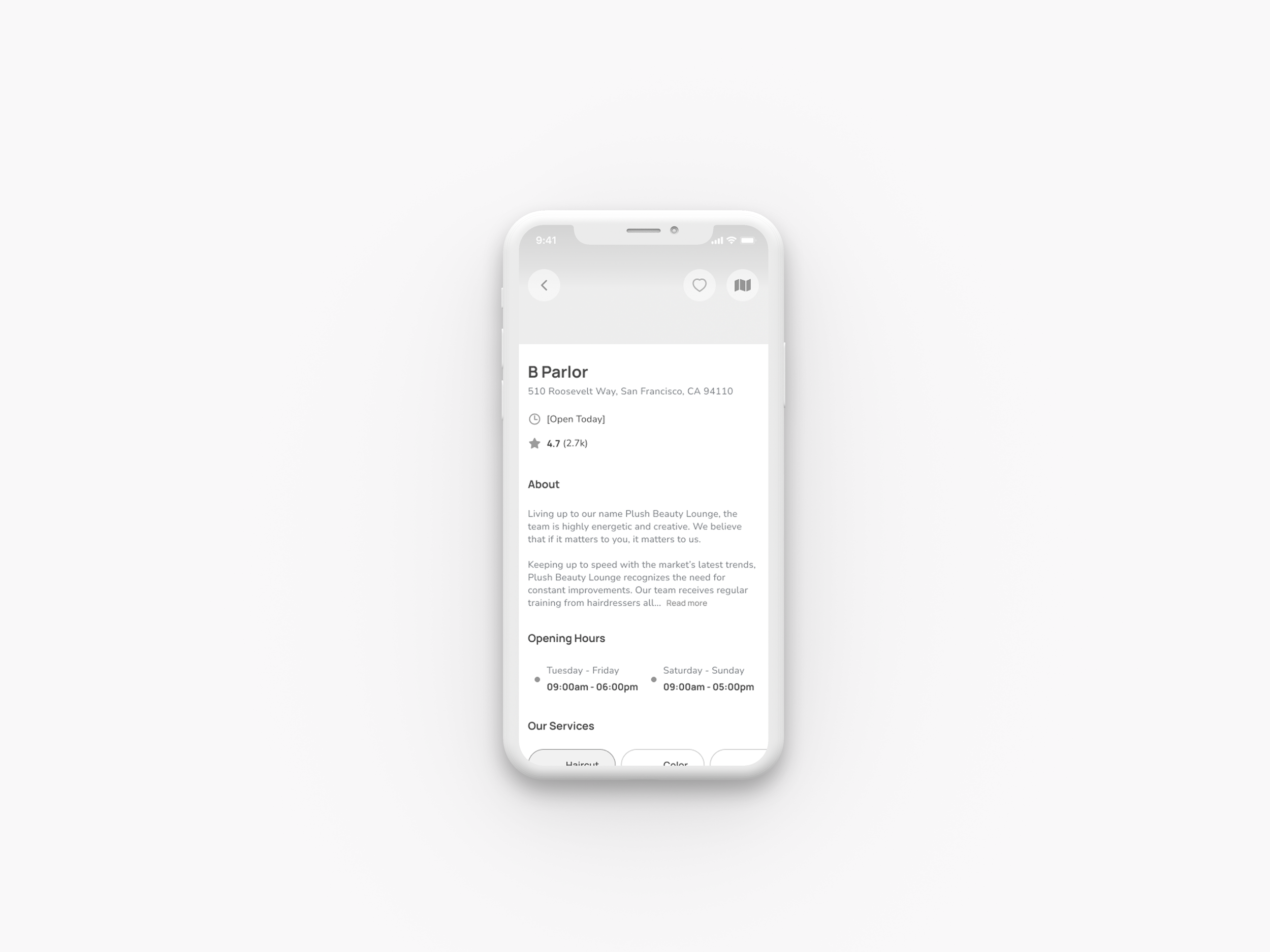
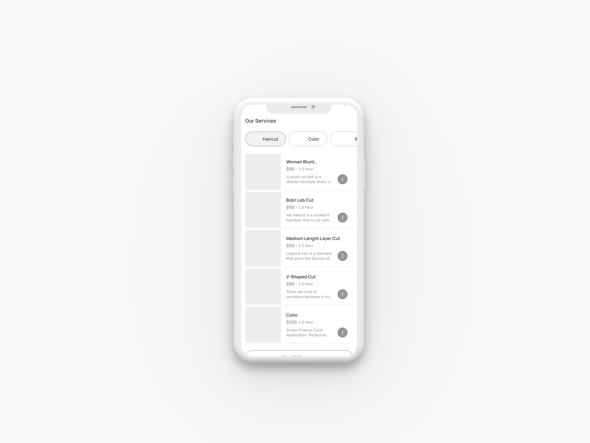
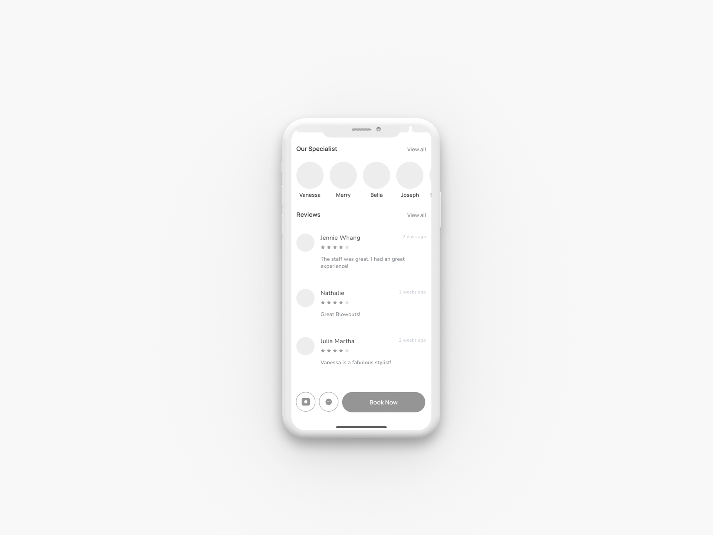
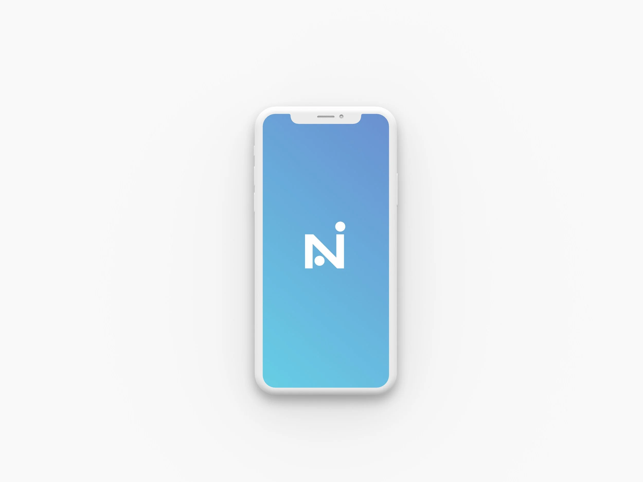
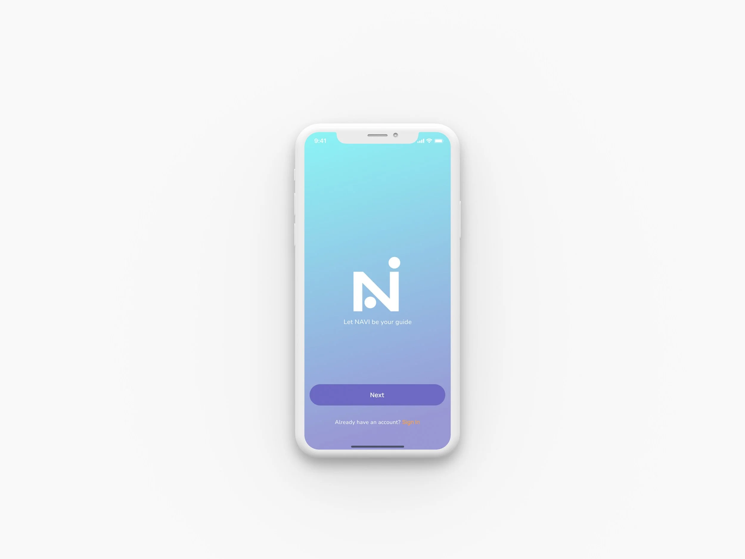
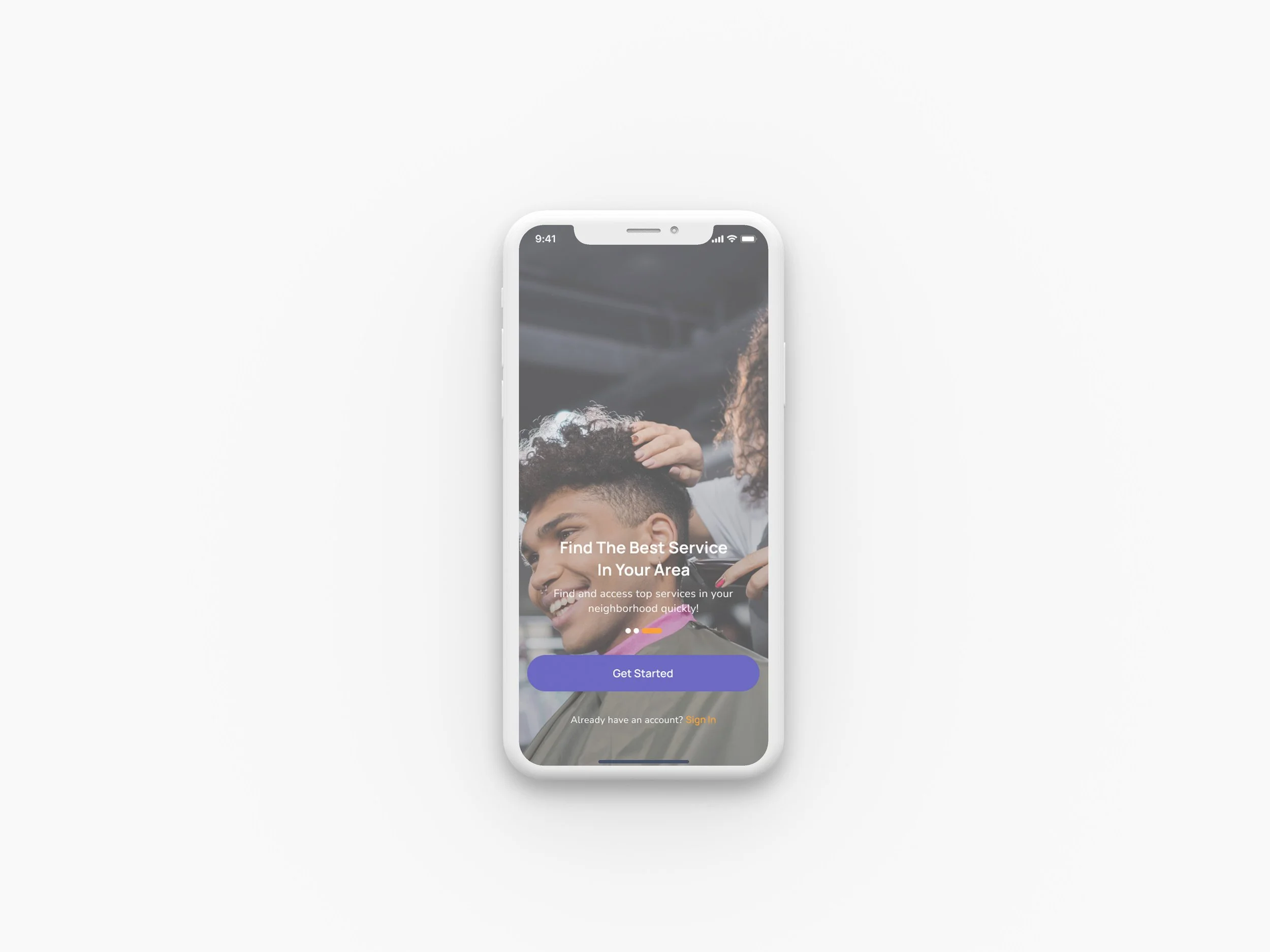
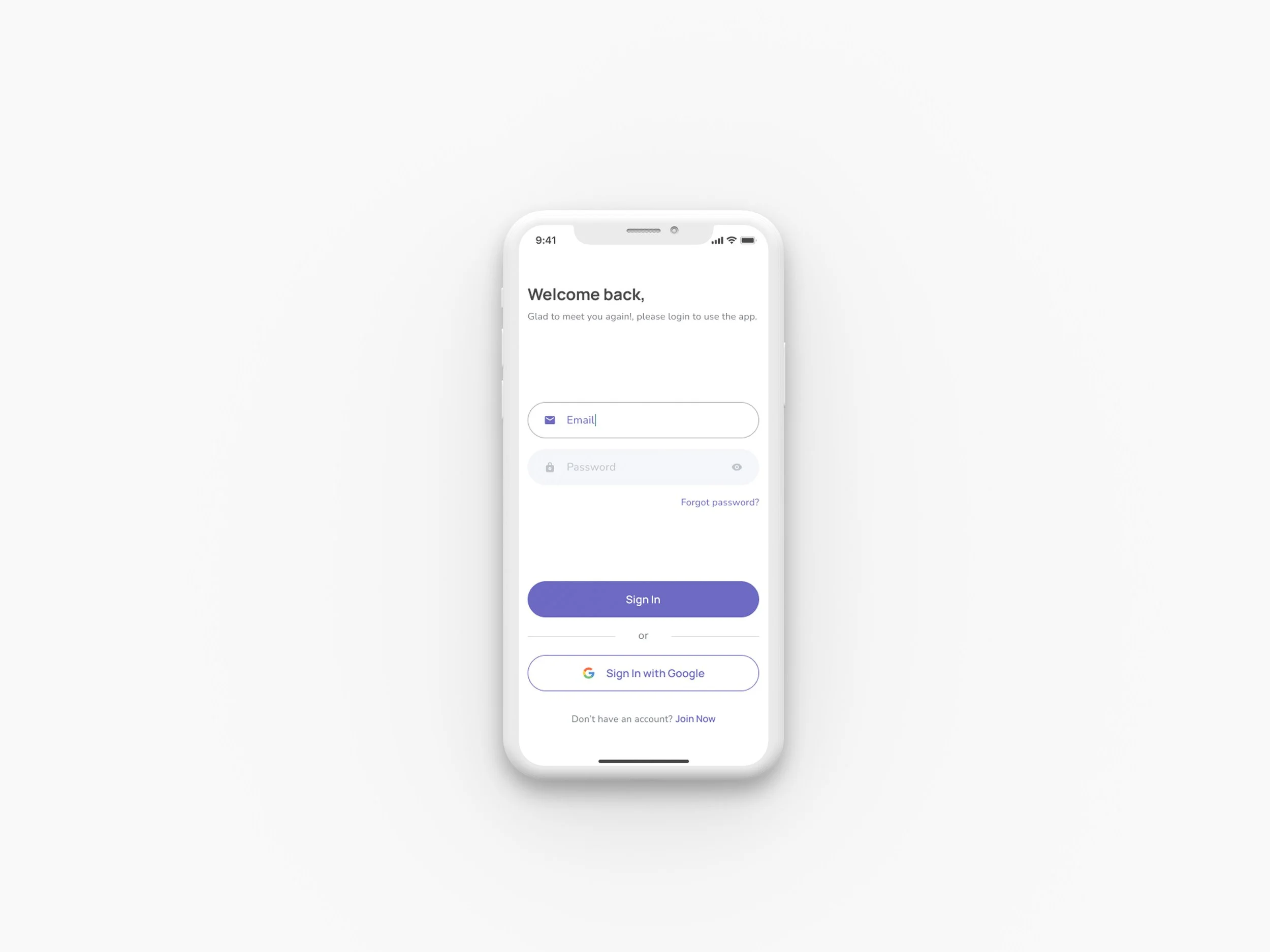
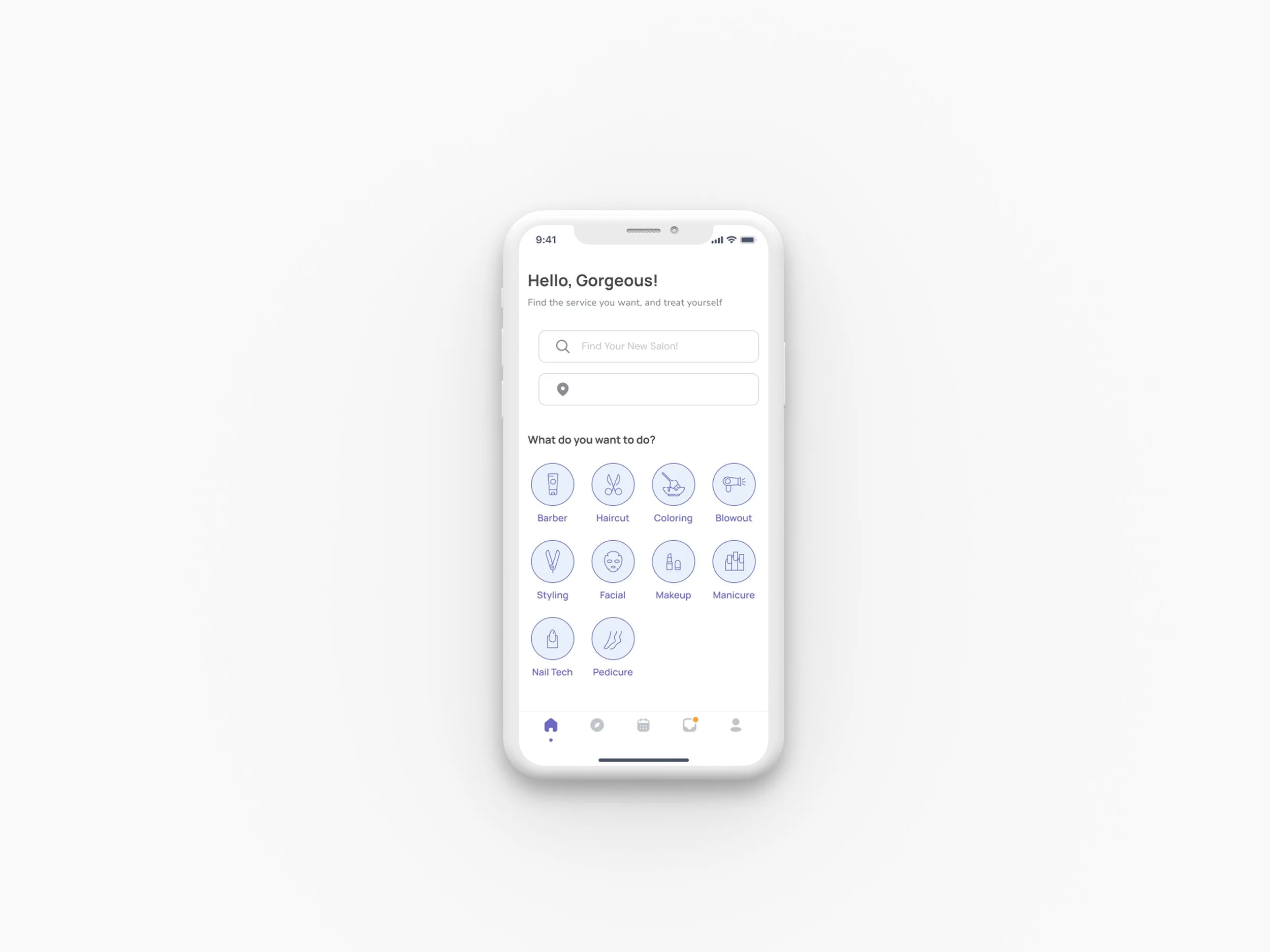
Final Design Direction
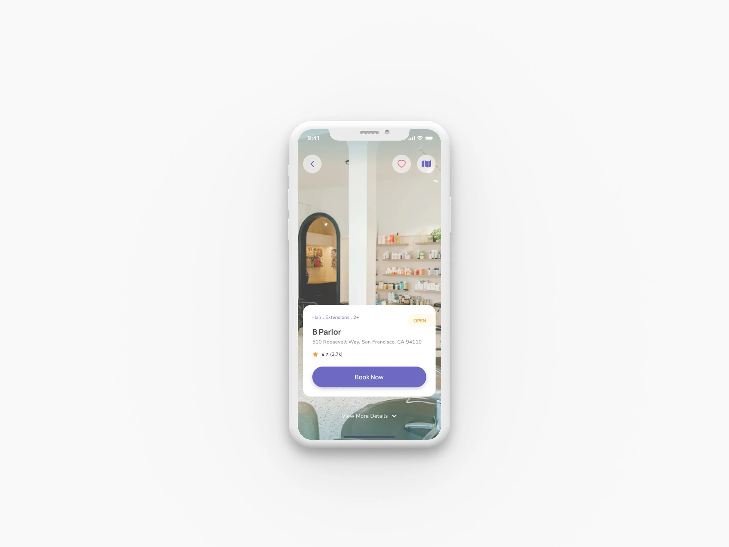
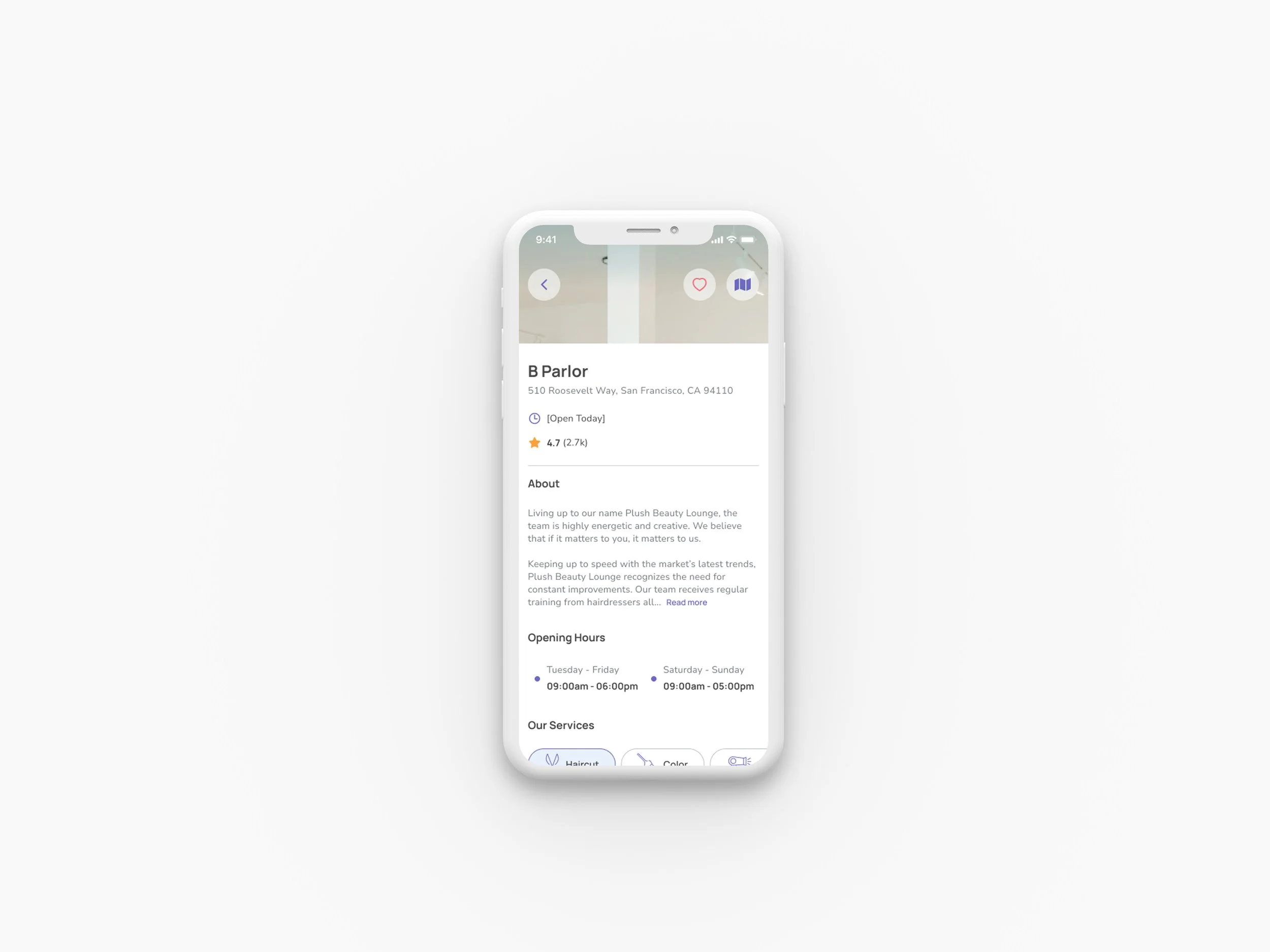
Final design direction incorporating user feedback - Splash screen and Home screen refinements
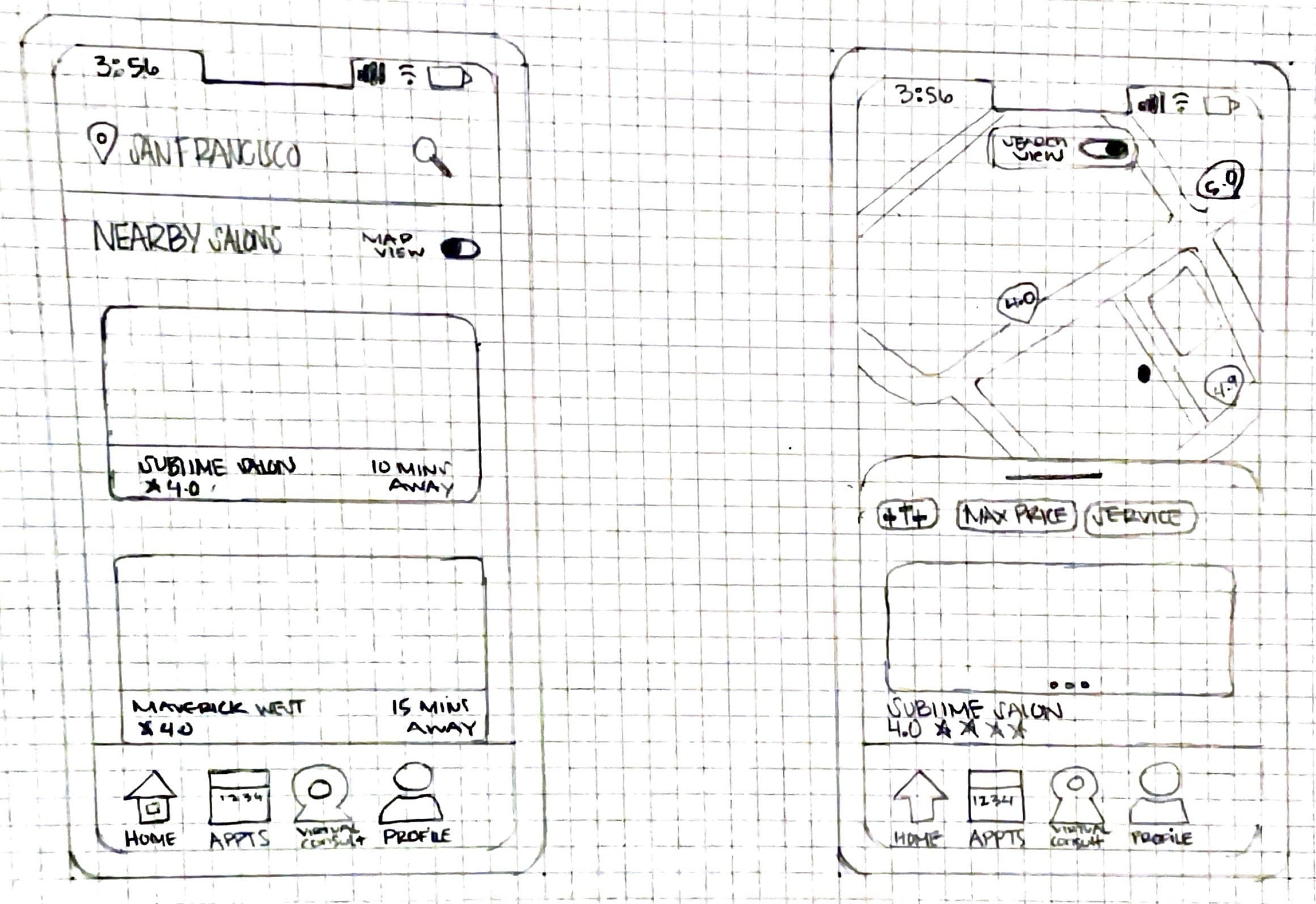
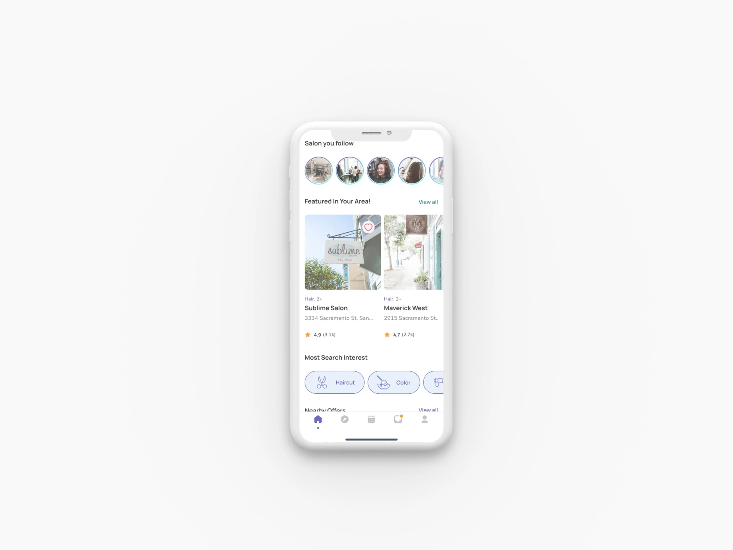
Final design direction incorporating user feedback - Salon list screen and Map screen refinements
Design Development
03
Specific Design Solutions
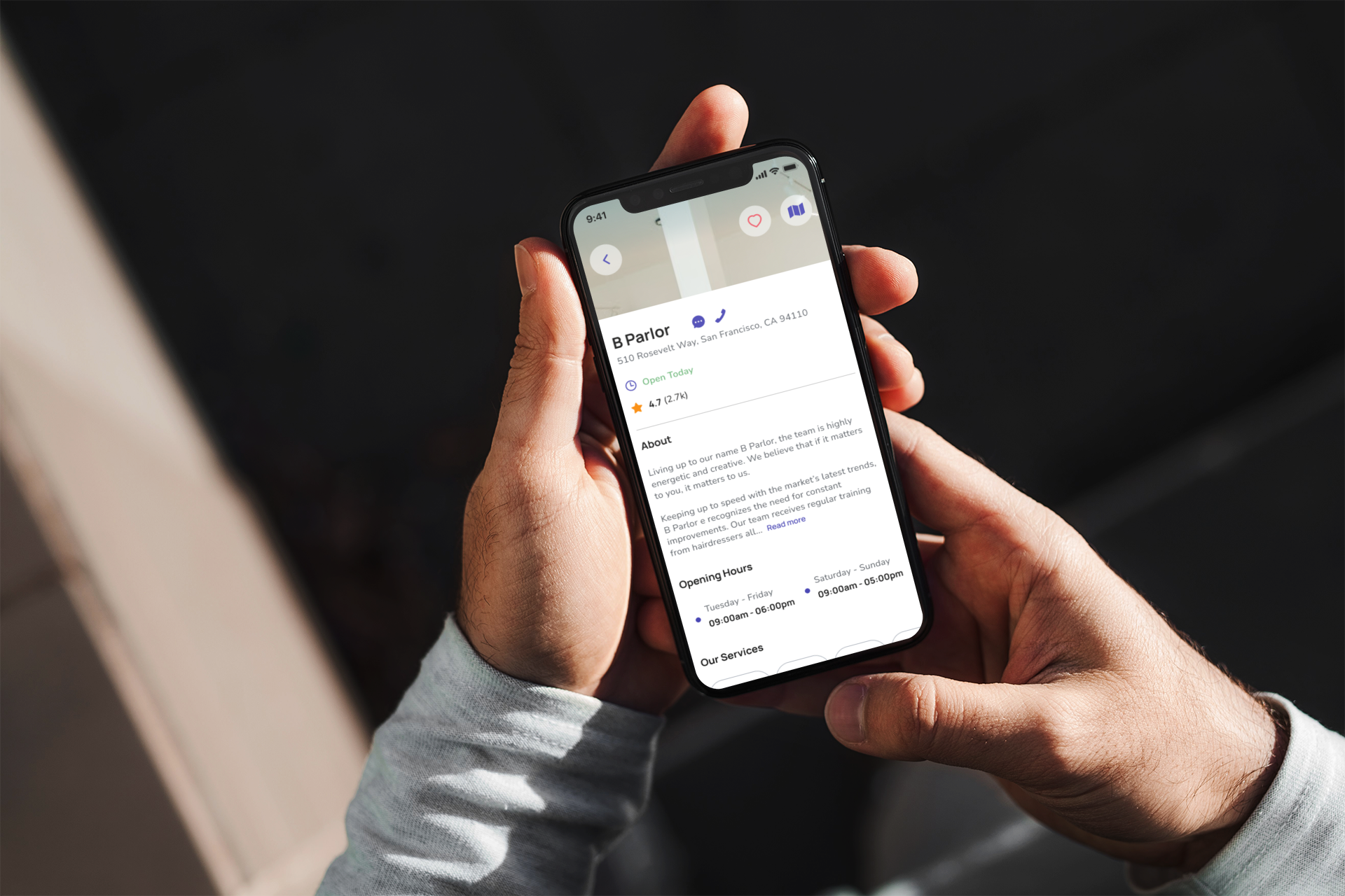
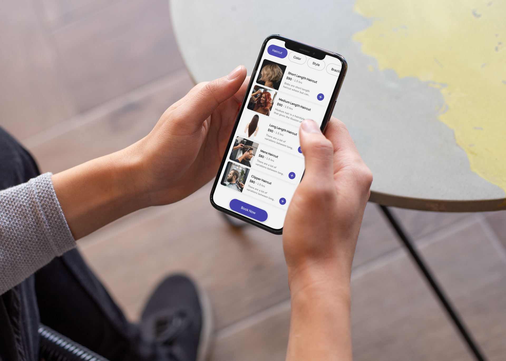
Based on research insights, I developed targeted solutions addressing core user needs:
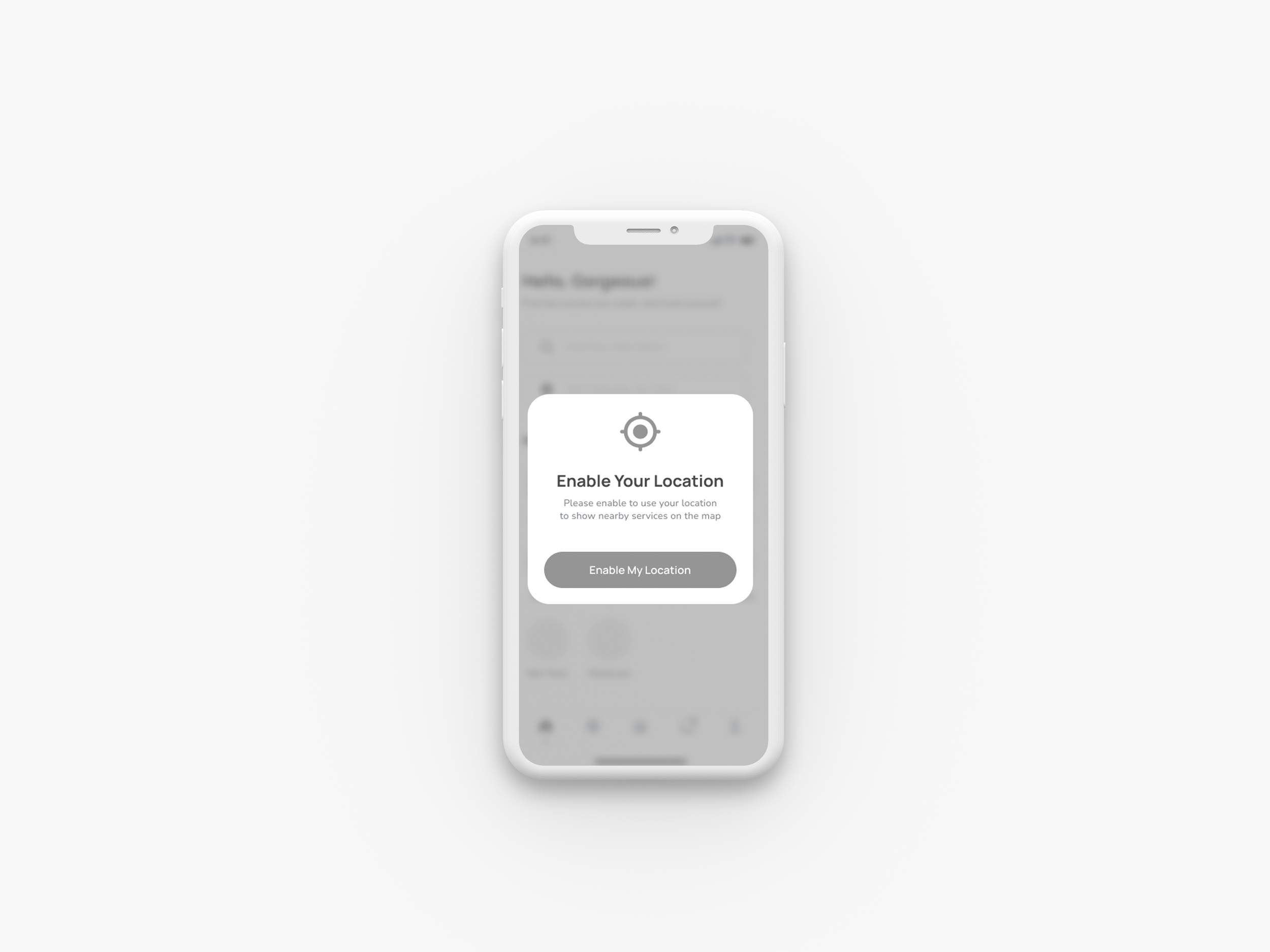
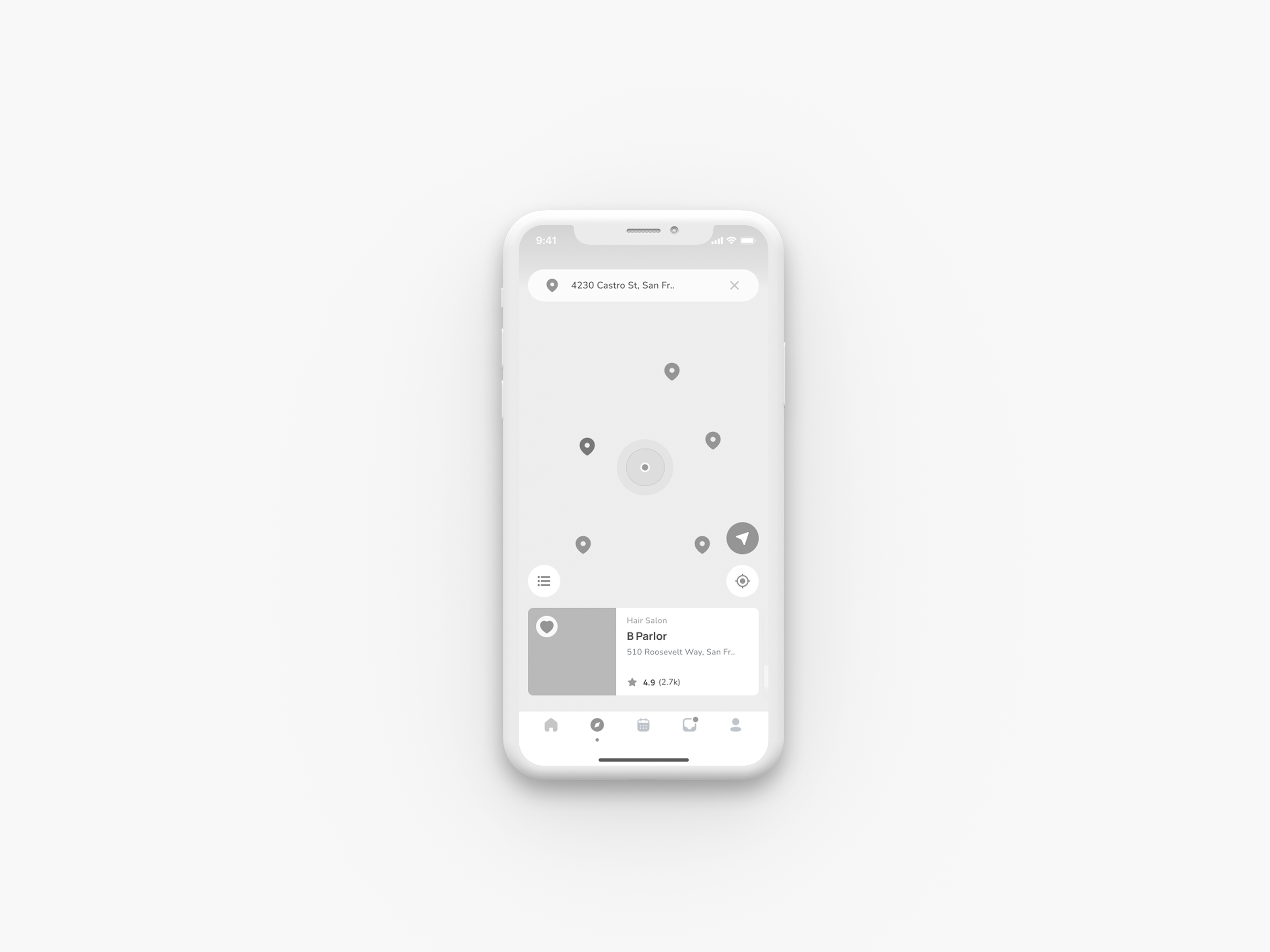
1. Geolocation-Based Salon Discovery
Distance calculation with proximity-based recommendations
Pin-drop functionality for specific areas
2. Virtual Consultation Feature
Addresses busy users who can't visit in person
Reduces pre-appointment uncertainty
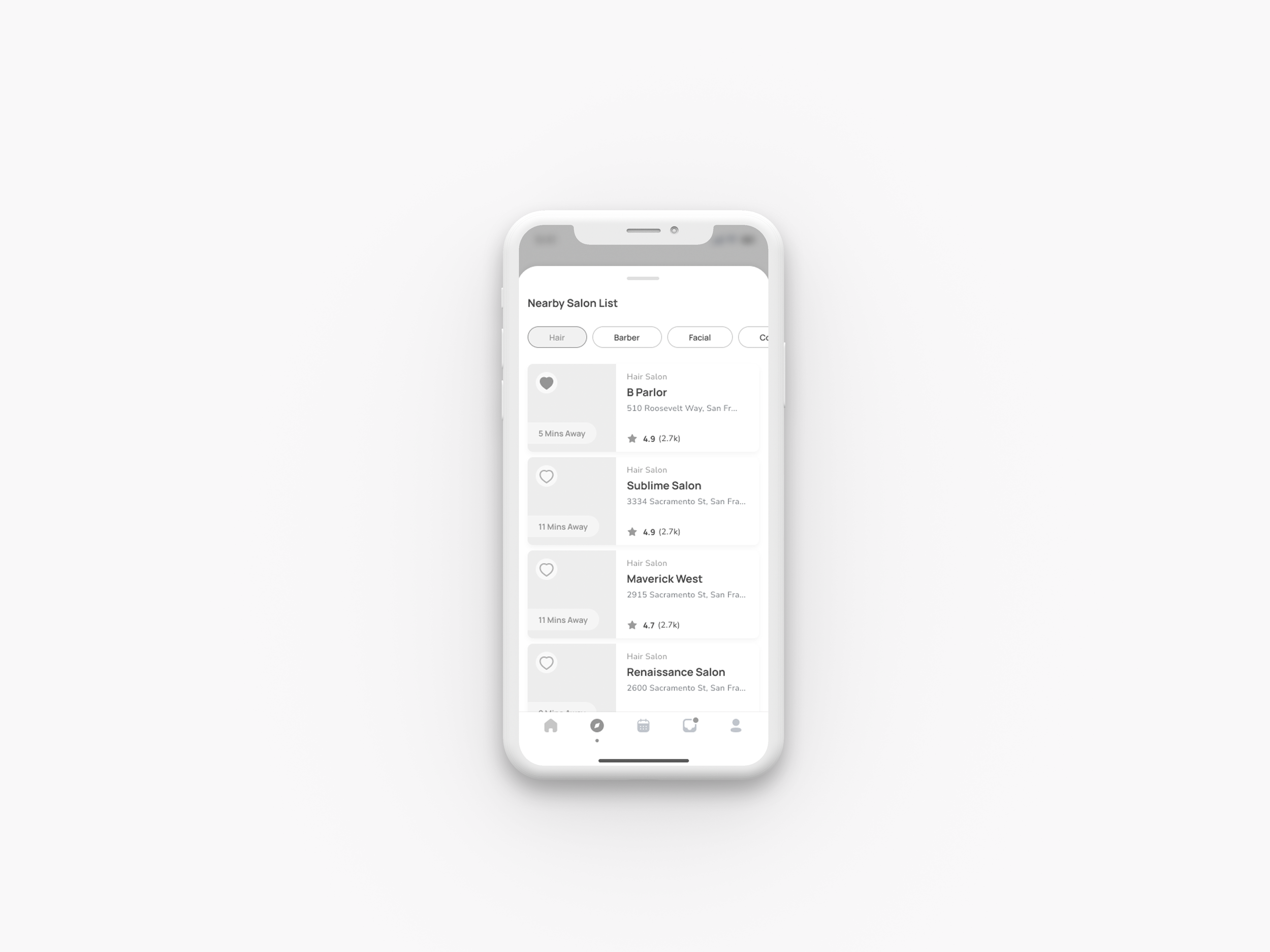
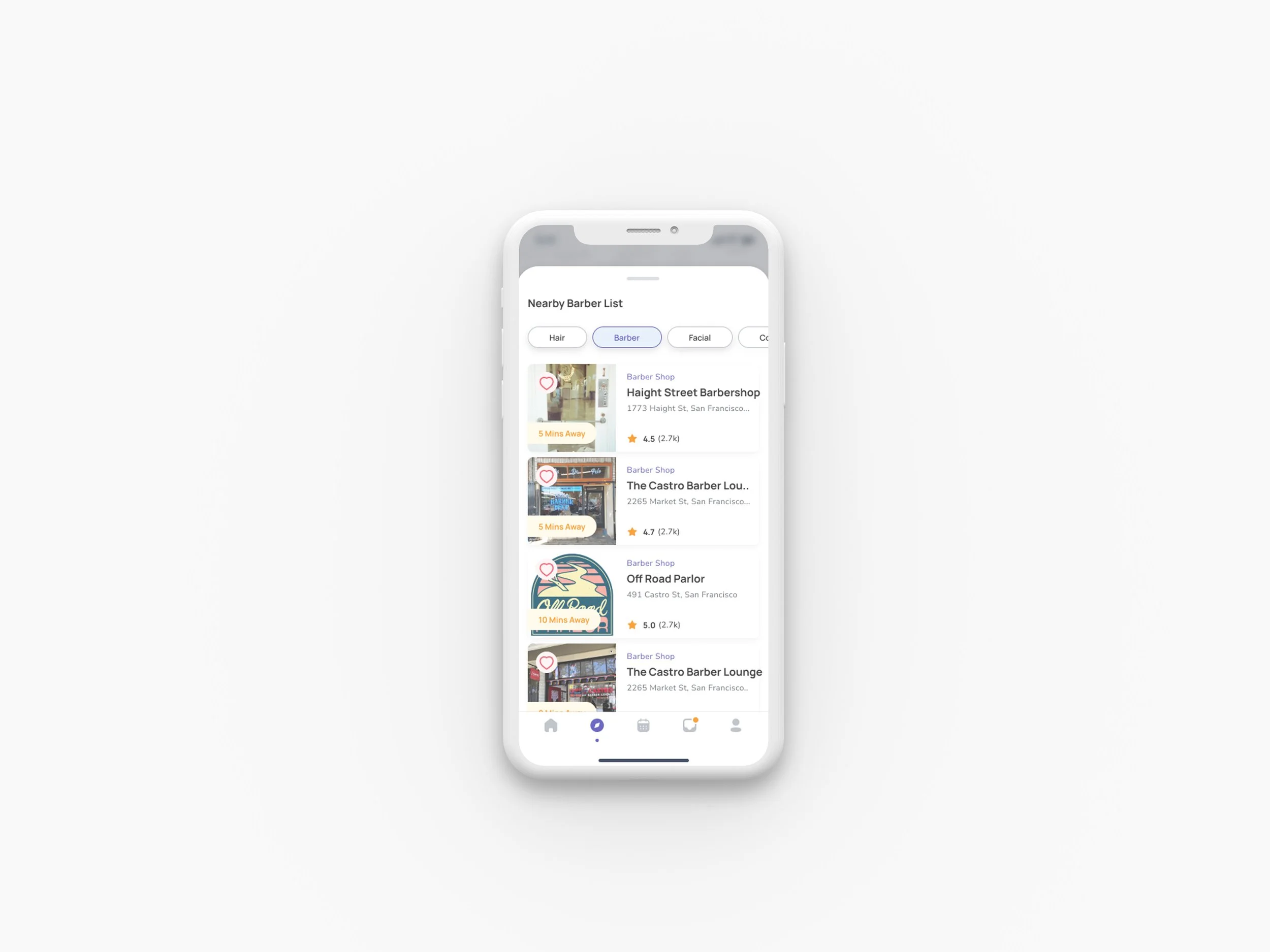
3. Dual View System
List and map views for comprehensive salon exploration
Seamless switching between viewing modes
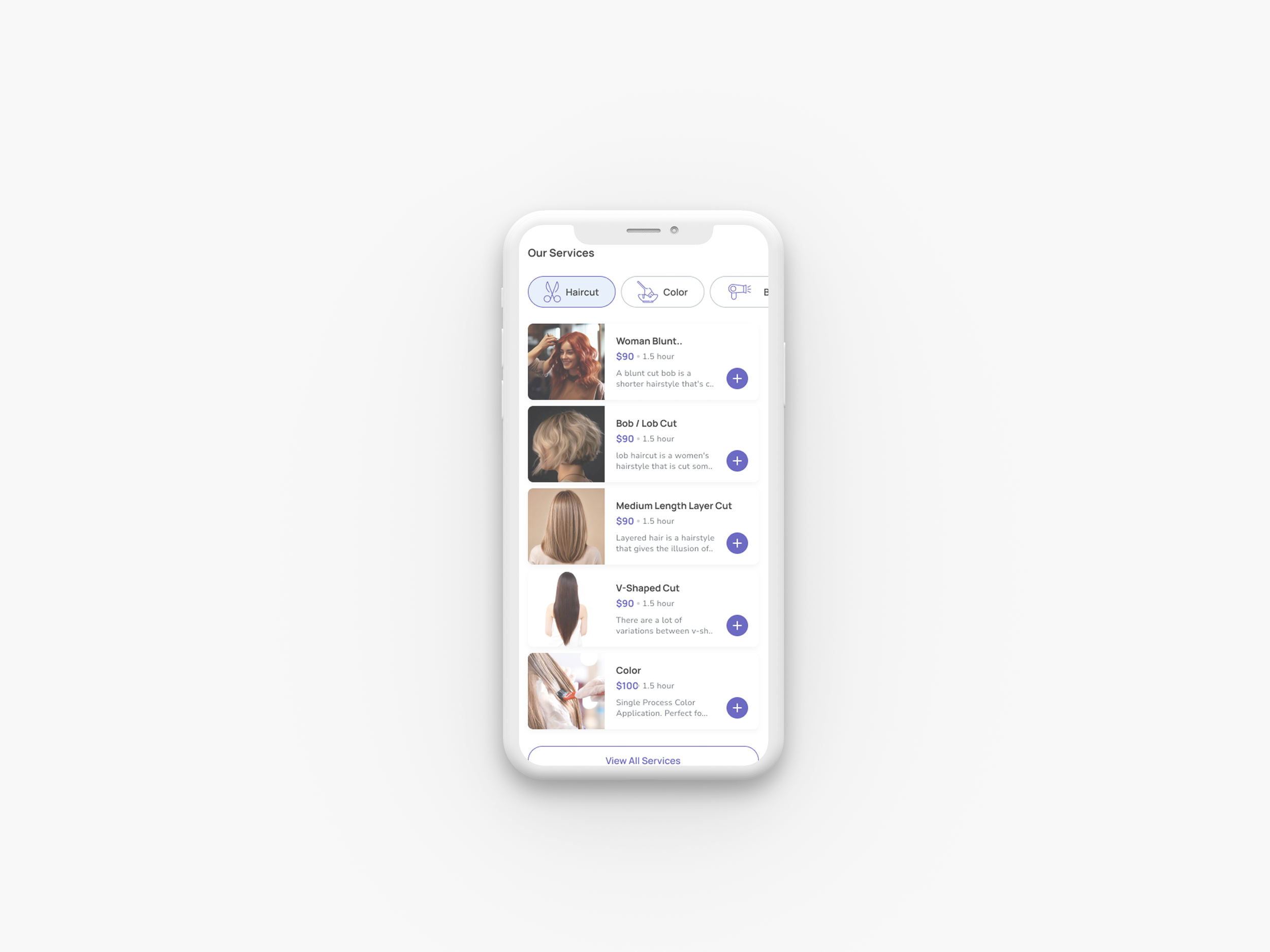
4. Advanced Filtering System
Filter by service type, ratings, and price range
Customizable search parameters
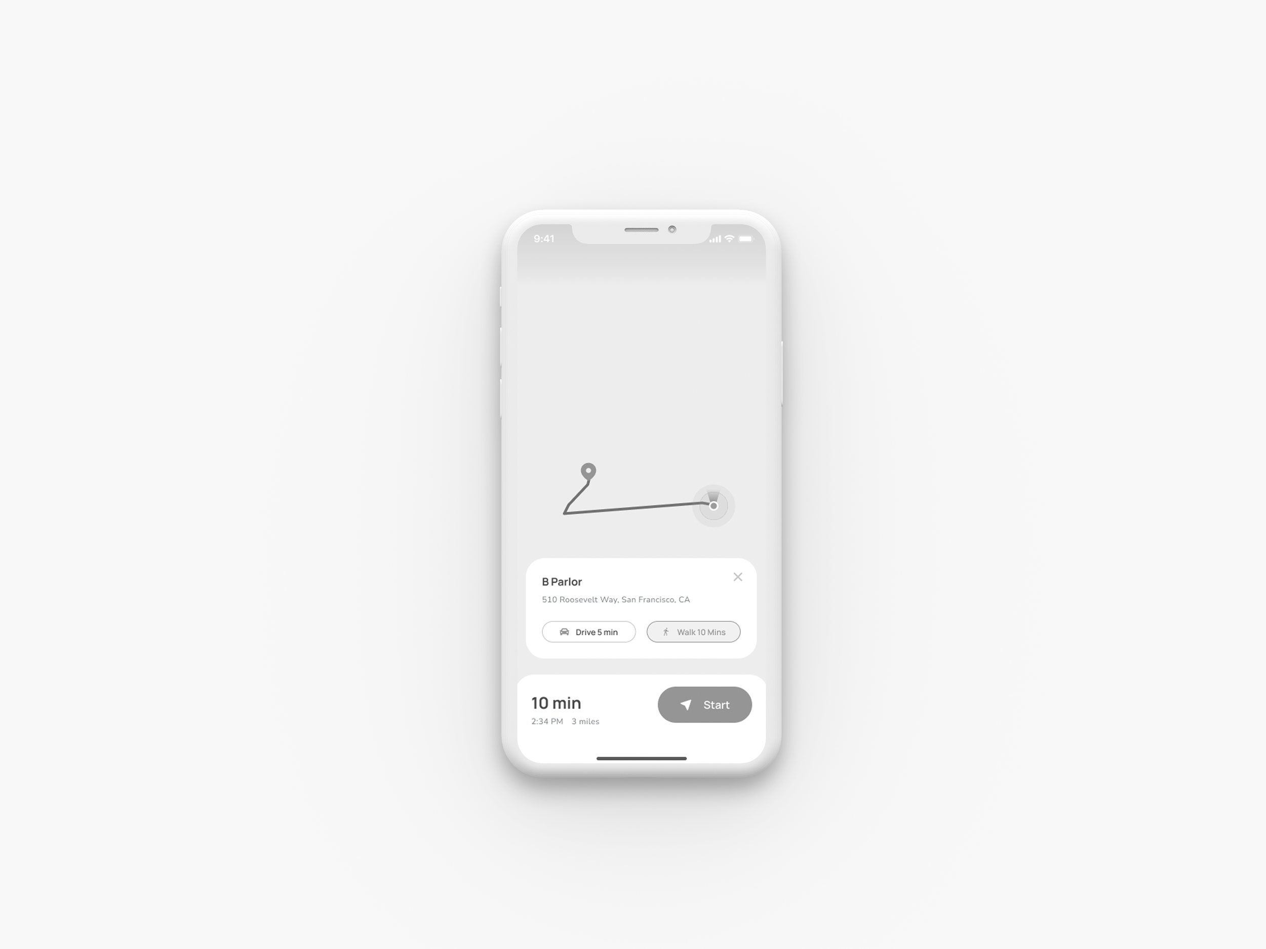
5. In-App Navigation
Integrated directions with mapping functionality
Reduces friction in booking-to-visit journey
Each solution directly addresses pain points identified in my user research.
1. Mid-Fidelity Development
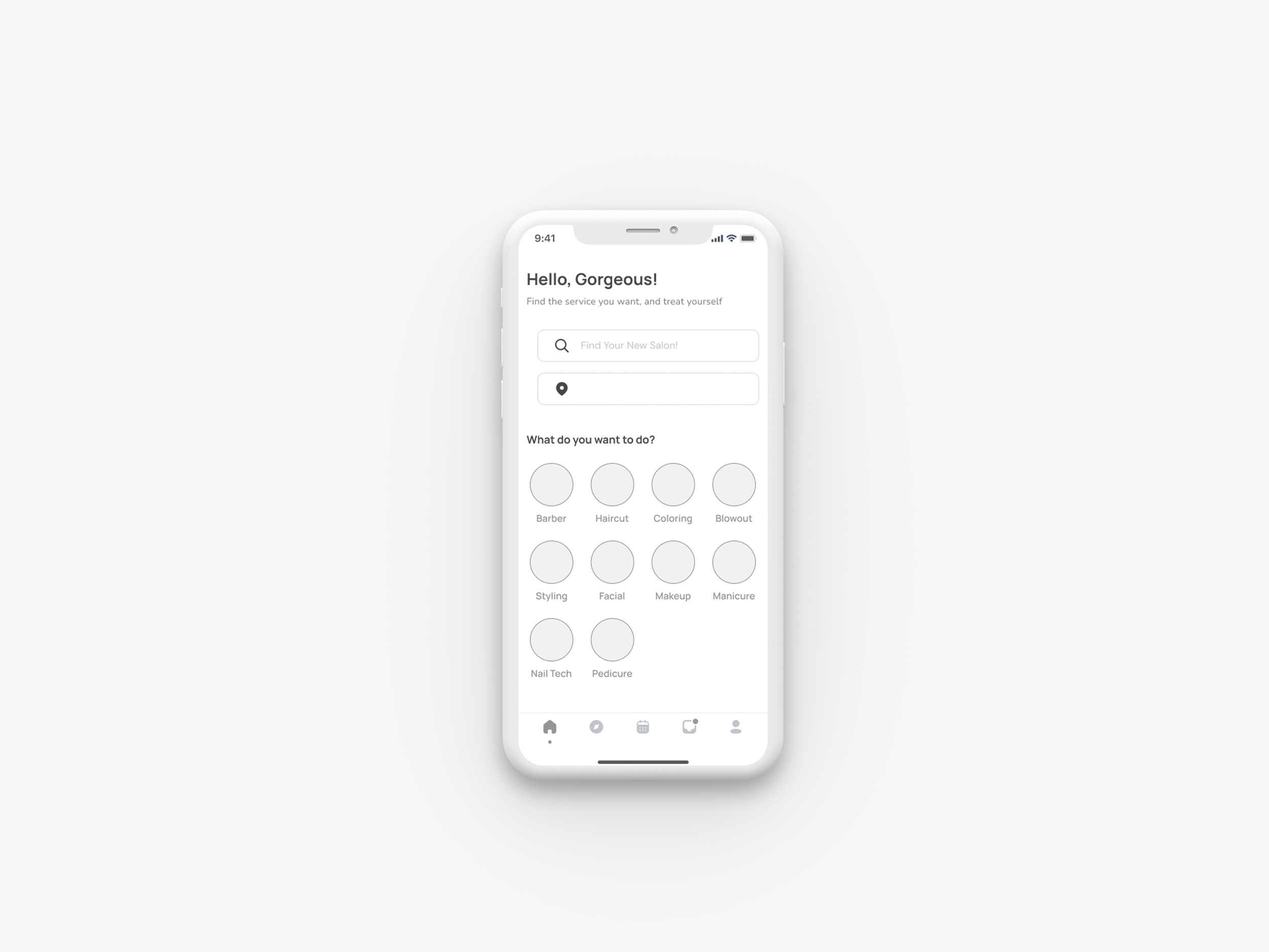
I developed multiple wireframe iterations to optimize the user experience, using my sketches as validation checkpoints for essential user paths. These iterations helped me refine information presentation and feature organization, particularly focusing on simplifying the home screen's dense content to enhance user understanding.
Wireframes
2. Visual Research Foundation
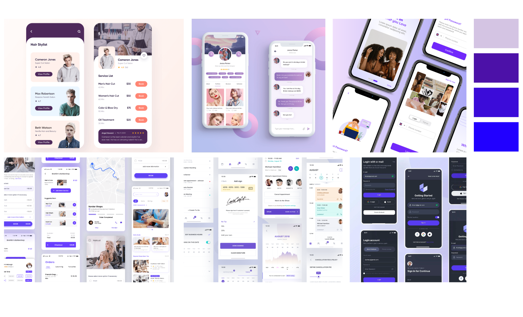
Based on my initial research and brand strategy, I developed a moodboard that emphasized three core brand qualities: reliability, user interaction, and trust - ensuring users feel confident they're always in capable hands.
Moodboard
3. Visual Research Foundation
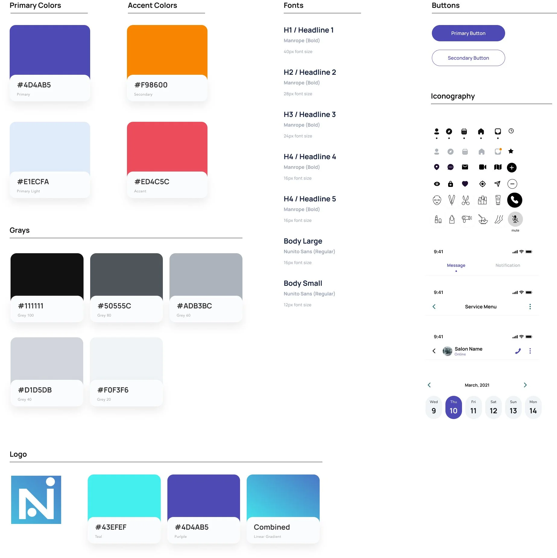
I created a comprehensive design system starting with a clean, simplistic logo that established the visual foundation. The consistent aesthetic throughout the app prevents user overwhelm while the purple and blue color palette reinforces trust, confidence, and reliability - core emotions users should feel when using Navi.
Style Guide
4. Prototype Creation
I prioritized key workflow screens for high-fidelity design development, focusing on the most critical user journeys. Through strategic color analysis, I identified the most effective visual elements while maintaining balanced content and color distribution to prevent user overwhelm.
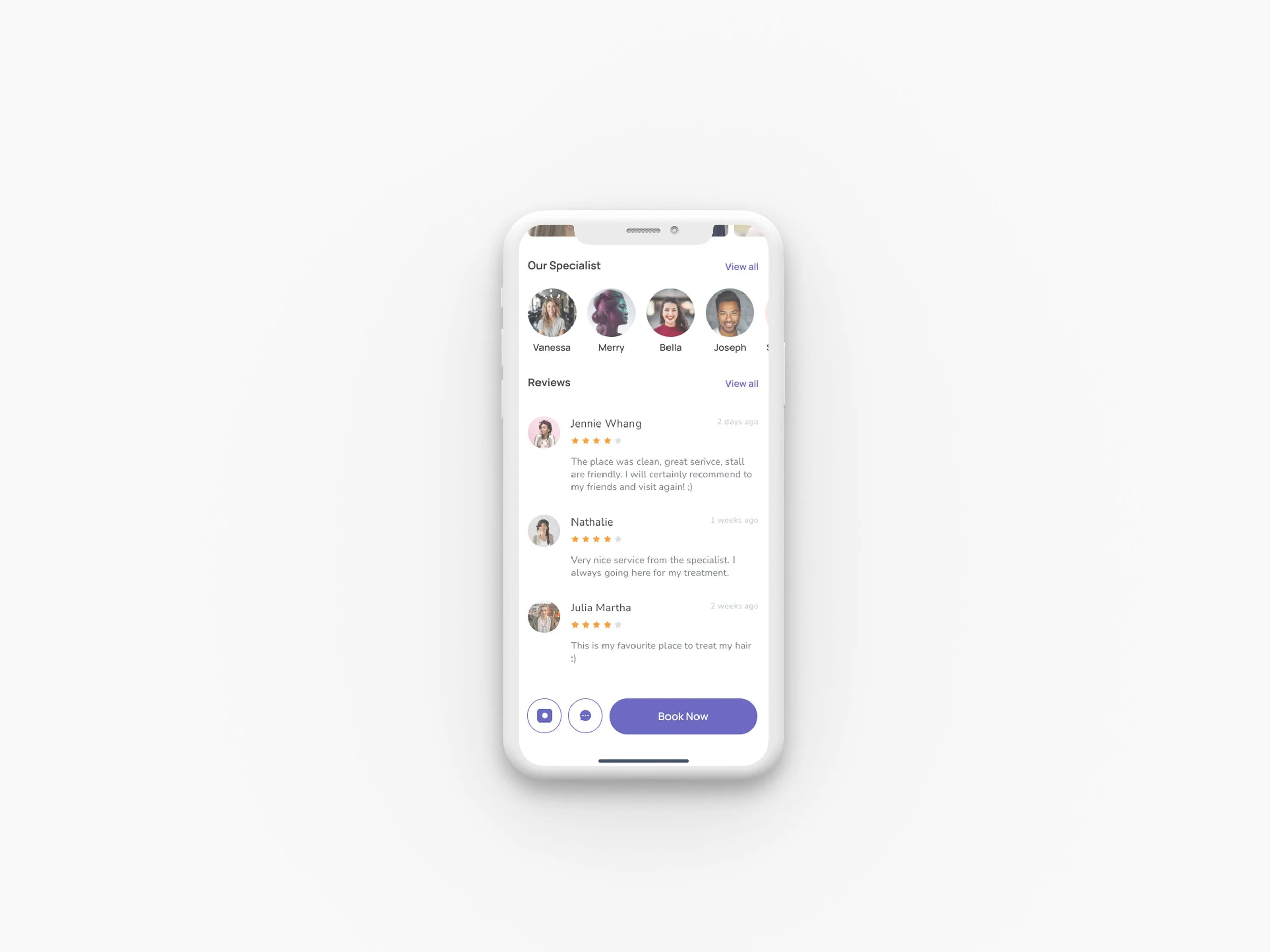
High Fidelity Screens
5. From Static to Interactive
Using Figma, I built functional prototypes for critical user tasks. Through continuous iteration, I addressed usability issues and refined unclear elements to optimize the user experience.
Prototype
Testing
04
Usability Testing
I developed a comprehensive usability testing plan with structured scripts and scenarios, conducting both remote and in-person sessions using the Figma prototype. Testing involved two rounds with 4-5 users each (total 9 participants, all female, ages 24-38) in 30-minute sessions. After Round 1 feedback, I implemented a critical map screen redesign that significantly improved user navigation and salon discovery efficiency.
Test Scenarios:
Scenario #1: Location-based Discovery Find a local salon in your area using the app's location features.
Scenario #2: Service-specific Search You need a specific service but are unsure which nearby salons offer it. Find a salon that meets your hair care requirements.
Scenario #3: Virtual Consultation Discovery You cannot visit a salon in person. Find a salon that offers virtual consultations.
Scenario #4: Style-specific Virtual Consultation You have a specific style in mind but cannot visit in person. Find a salon that accepts virtual consultations or photos prior to your visit.
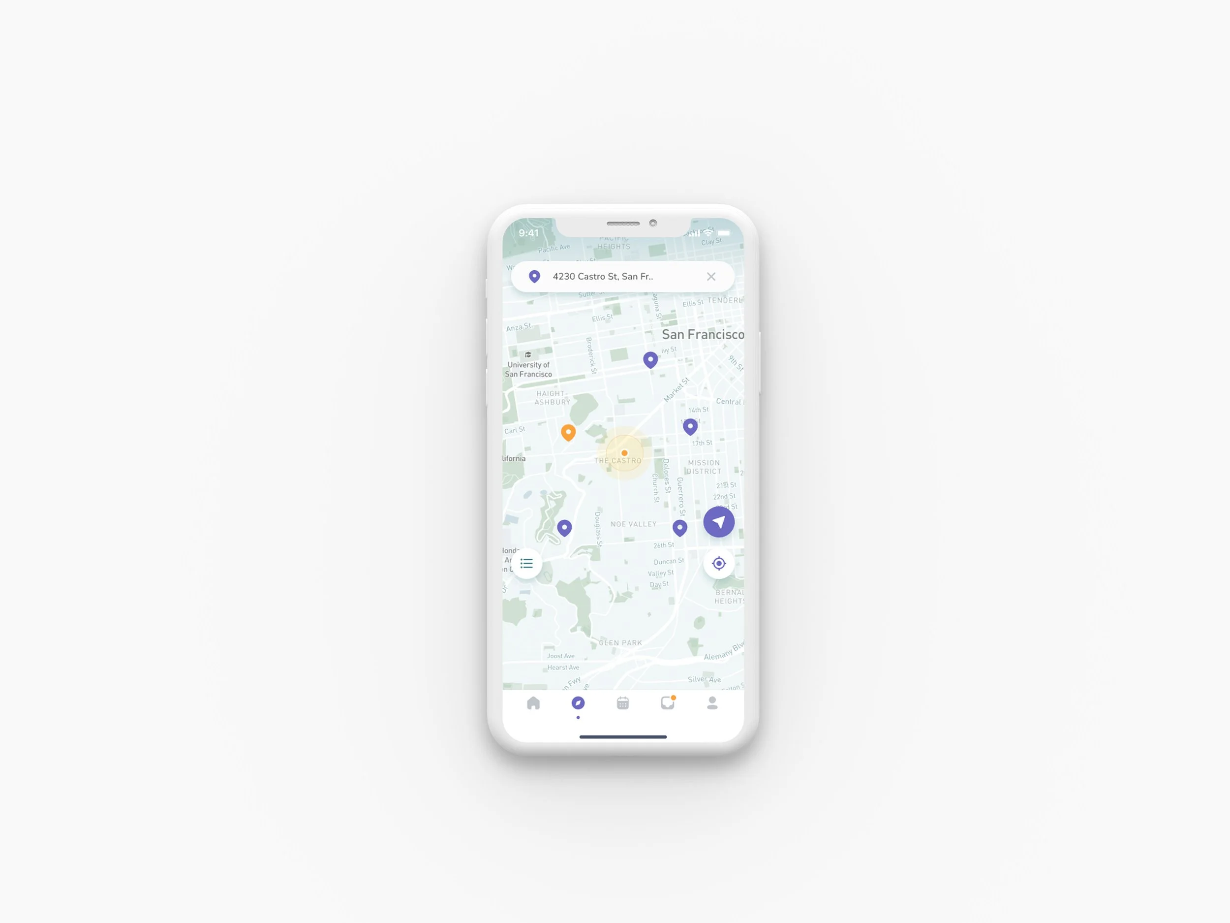
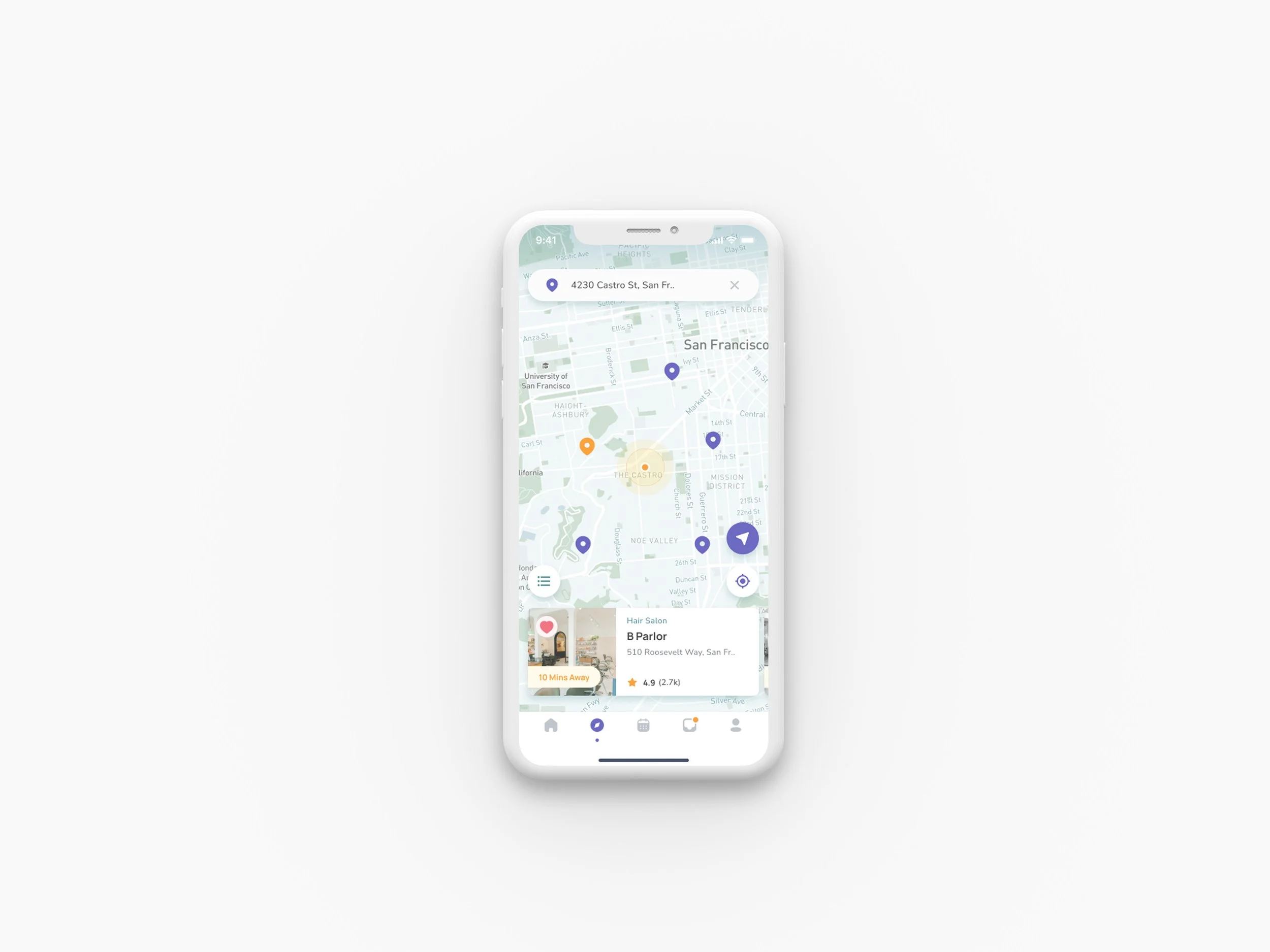
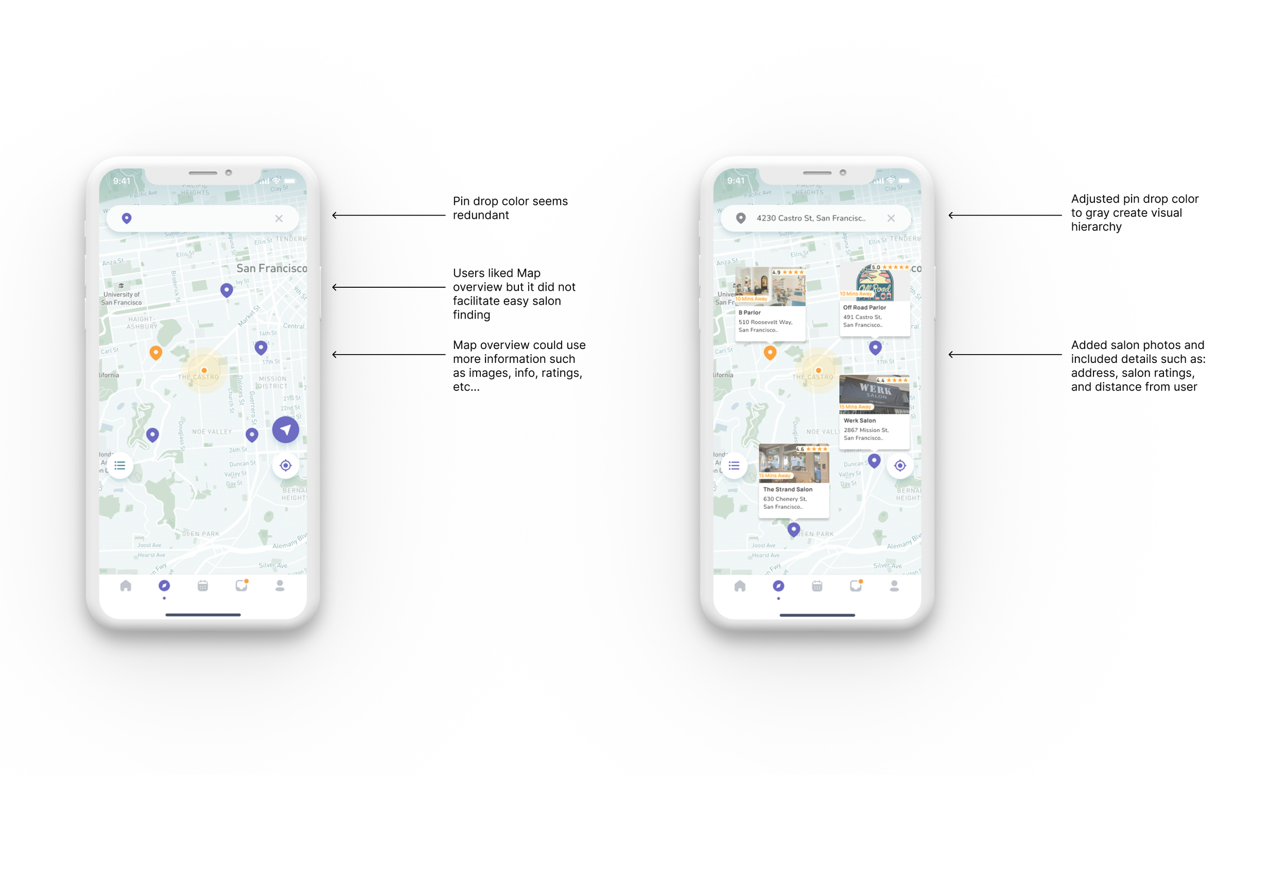
Issue 01: Map Overview Fails to Facilitate Easy Salon Discovery
Summary:
6 out of 9 users found the map screen interface confusing and non-intuitive for salon discovery
3 users expected to see salon images and information for nearby locations directly on the map
Recommendations:
Remove horizontal scroll card deck to reduce interface complexity
Add informational cards with salon images, details, and ratings positioned near corresponding map pins
Apply accent color to the pin representing the closest salon to improve visual hierarchy
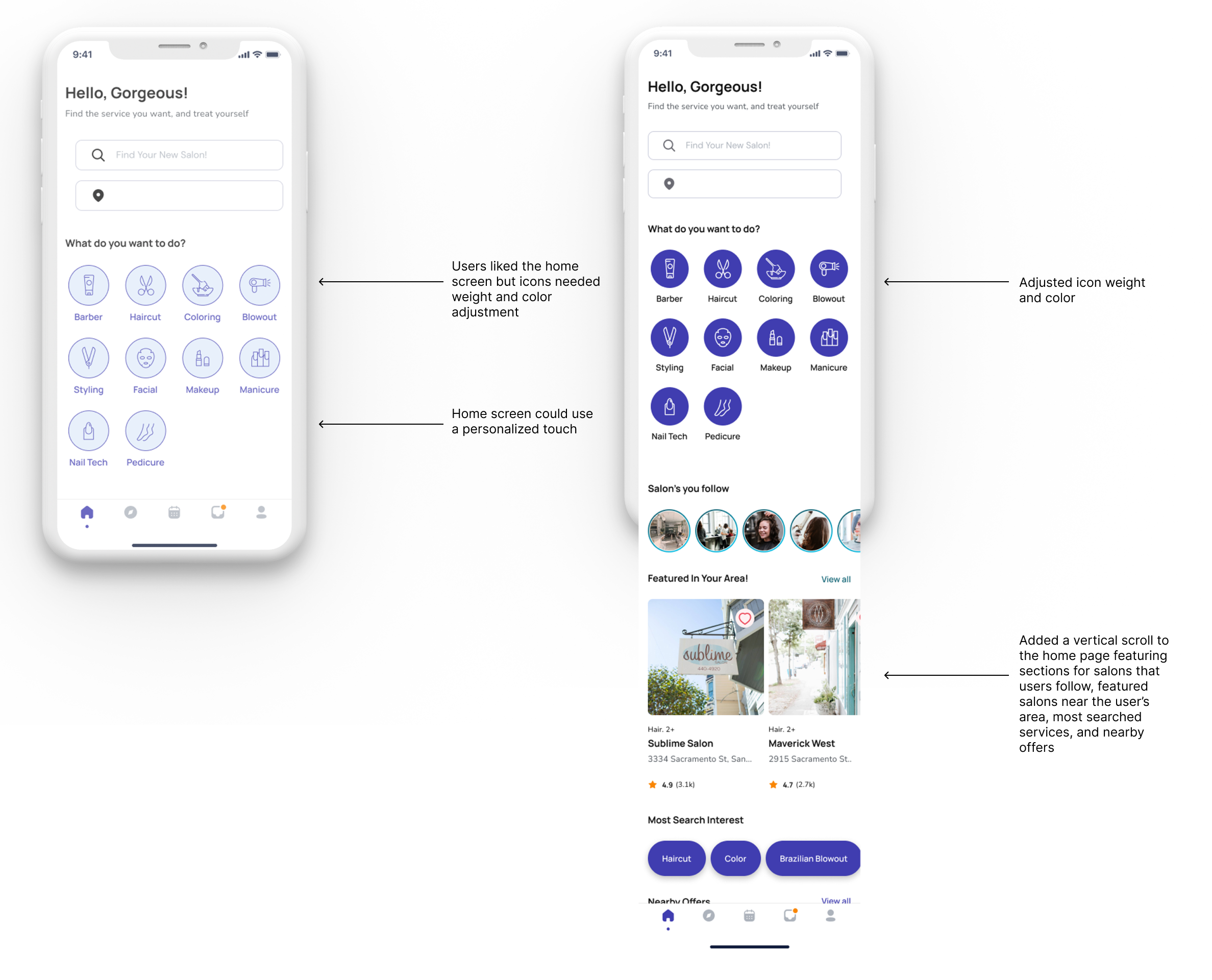
Issue 02: Home Screen Iconography Lacks Visual Weight and Clarity
Summary:
3 users bypassed service icons entirely, navigating directly to the map screen instead
2 users perceived service icons as static elements rather than interactive buttons
Recommendations:
Enhance icon color contrast to clearly indicate interactive, selectable elements
Increase icon size and visual weight to improve prominence and discoverability
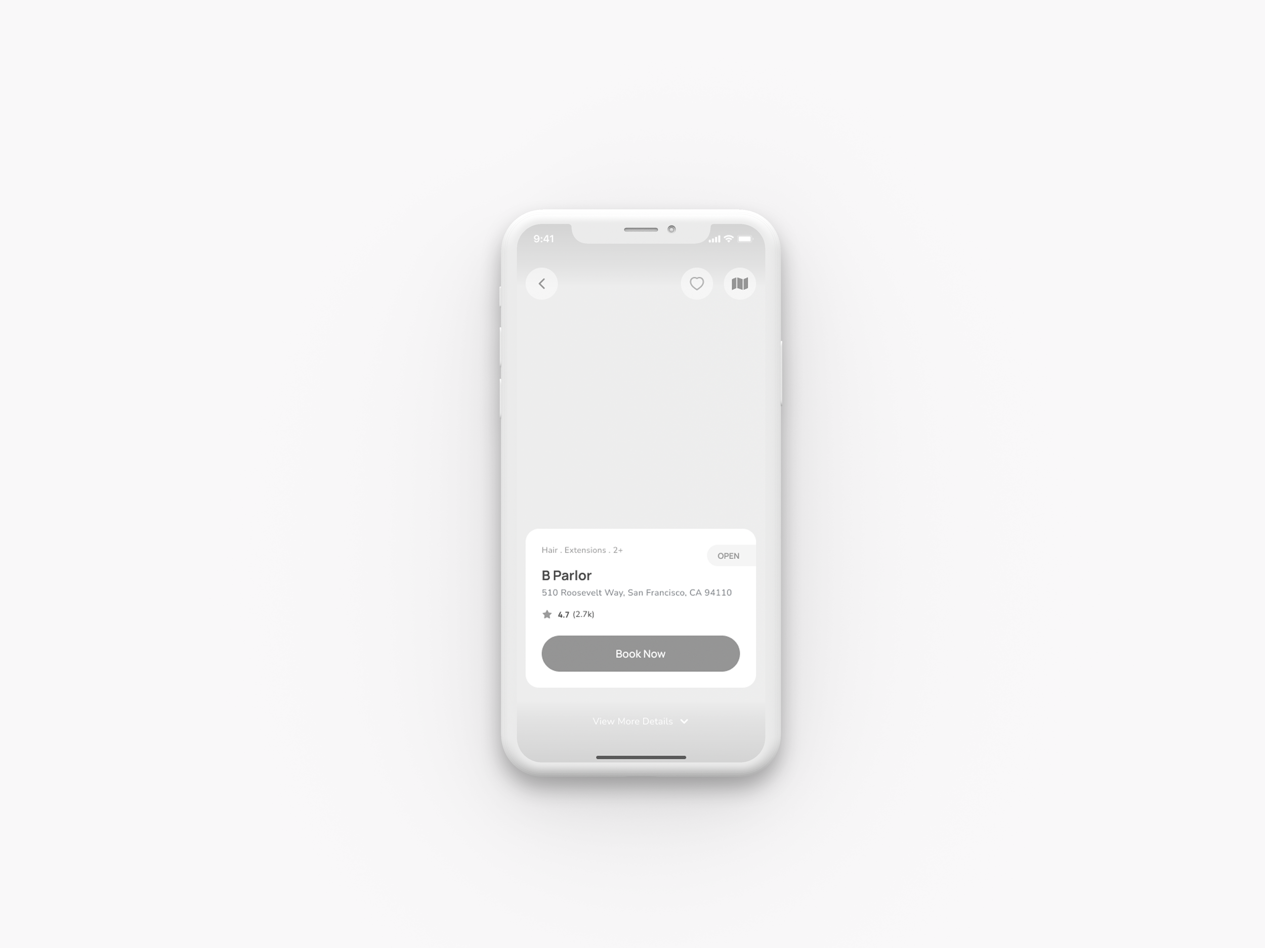
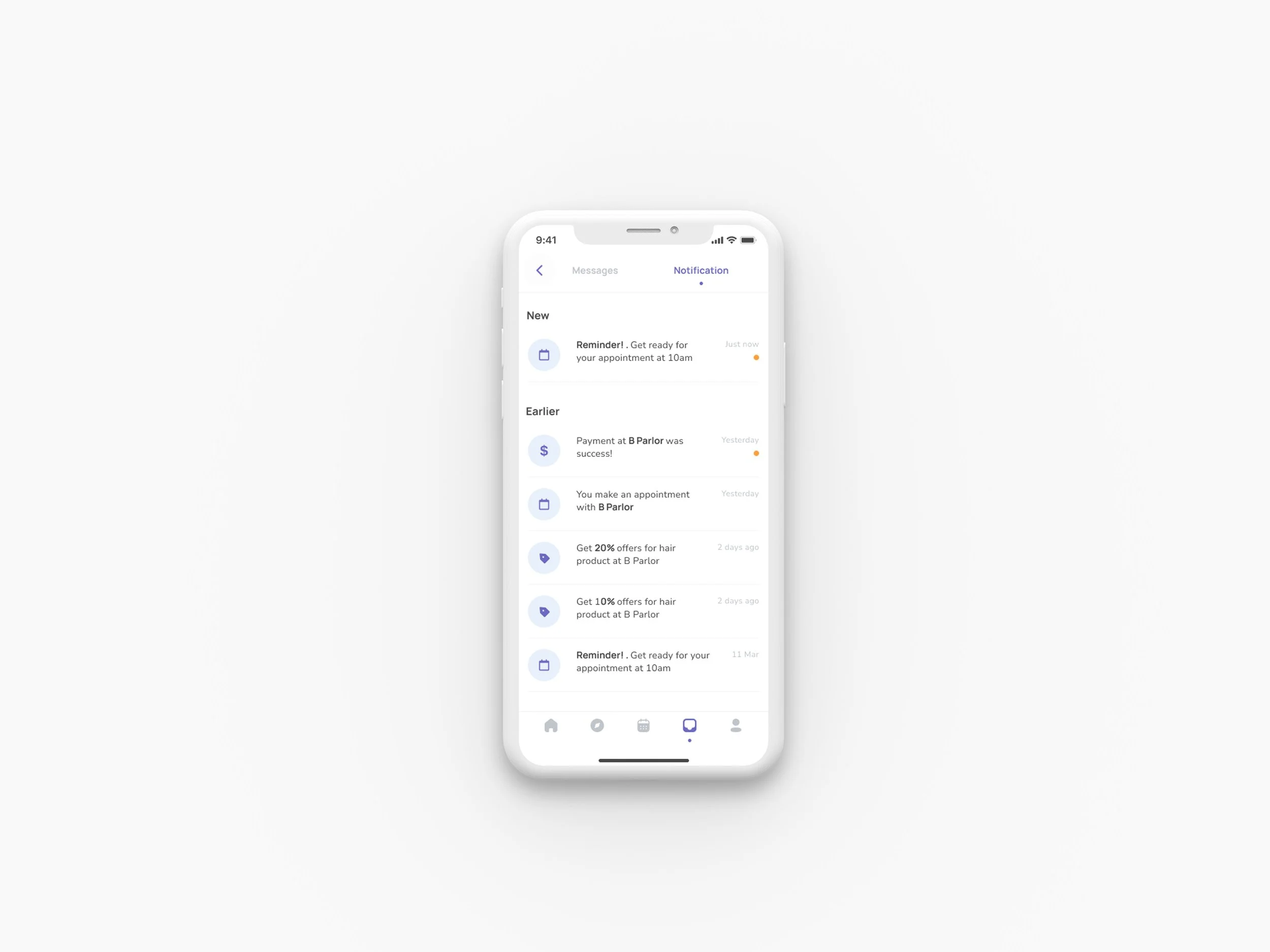
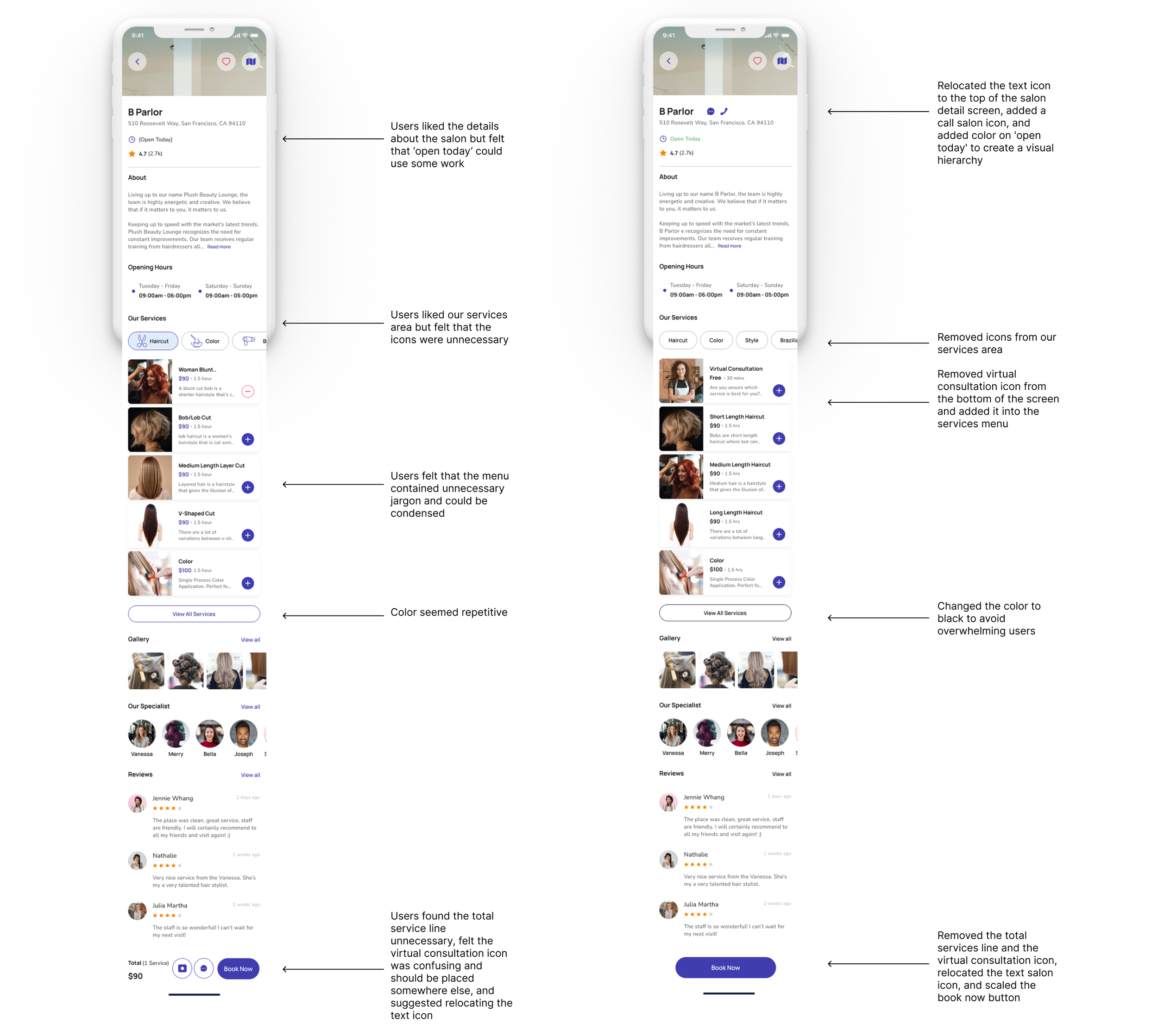
Issue 03: Virtual Consultation Service Lacks Clarity and Visibility
Summary:
3 users couldn't locate virtual consultation options in the service menu
3 users found the virtual consultation icon confusing and difficult to see
Recommendations:
Remove the virtual consultation icon from the main salon screen to reduce confusion
Add virtual consultation as a menu item within the salon's service offerings
Include available stylists and their schedules within the virtual consultation service for better transparency
Results & Impact
Task completion rate improved through iterative testing:
Quantitative Improvements:
Users successfully completed salon discovery in 3 taps
Virtual consultation feature addressed 100% of pre-appointment uncertainty
20 screens prototyped with continuous iteration
Design changes resolved all 3 major usability issues identified
Two-round testing process enabled data-driven improvements
Users successfully completed salon discovery in 3 taps
Virtual consultation feature addressed 100% of pre-appointment uncertainty
Design changes resolved all 3 major usability issues identified
Final Solutions
05
Reflection
This project reinforced that user testing reveals critical blind spots in design assumptions and that effective design isn't about personal aesthetic preferences - it's about solving real user problems. The most valuable insight was discovering how visual hierarchy directly impacts user behavior - users consistently bypassed low-contrast icons and struggled with unclear navigation paths, with 6 out of 9 users finding the map interface confusing.
The usability testing revealed that small interface changes create significant user experience improvements. Moving forward, I now approach design with healthy skepticism about my initial solutions and will prioritize early and frequent user validation over perfecting initial concepts.
Key Takeaways:
Test early and often - User feedback in the wireframe stage could have prevented major usability issues
Visual hierarchy is behavioral - Low-contrast elements aren't just aesthetically weak, they're functionally invisible to users
Assumptions are expensive - Every design decision I made without user input required costly revisions later
Simplicity beats complexity - Users consistently preferred streamlined interfaces over feature-rich but confusing ones
Empathy mapping pays dividends - Understanding Natasha's time constraints directly informed successful design decisions
Research-Driven Insights:
Quantitative data from 41 participants provided concrete evidence for design decisions
90% prioritizing reviews directly informed our rating system design
Competitive analysis of 5 platforms identified clear market differentiation opportunities
Expert validation confirmed alignment with industry best practices
This experience fundamentally changed how I approach design problems - from assumption-driven to evidence-driven decision making.